In my previous post on the Problem with Free, we explored a fundamental human truth: when something is given entirely for free, we tend to undervalue it. True value is born when we invest even a small amount of our own skin in the game. In this post, I want to highlight how shifting the model from a total “freebie” to a strategically subsidized partnership can have a massive, lasting impact on both our society and our environment.
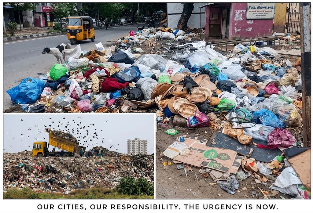
“Outer order contributes to inner calm.” – Gretchen Rubin If we want to bring that order and calm to our expanding cities, we have to look closely at our daily civic habits.
Image generated using Gemini
When looking at the complex challenges of urban governance, waste management consistently ranks near the top. Traditional state interventions usually focus on the end of the line—building massive landfills or upgrading heavy processing plants. However, the most sustainable, cost-effective solutions begin right inside the citizen’s kitchen.
The fundamental hurdle isn’t technology; it’s getting households to consistently separate wet and dry waste at the source. If state and municipal administrations want to solve this permanently, they can leverage an incredibly elegant, behavioral tool: incorporating a high-quality, two-bin system into annual welfare distributions—such as the state’s traditional Pongal gift hampers—backed by a smart co-payment model. Because true civic change begins at home, shifting the narrative from a “welfare handout” to a “partnership for the future” can revolutionize public psychology and create a cleaner, prouder society.
The Power of a Behavioral “Nudge”
Why should a government hand out dustbins for free? The answer lies in behavioral economics and Nudge Theory, which suggests that positive reinforcement and indirect suggestions are far more effective at changing human habits than strict mandates or penalties. What might look like an upfront public expense is actually a highly strategic civic investment that can pay massive dividends.
Overcoming the “Free” Trap: The ₹50 Co-Payment Model
Handing out bins entirely for free risks them being relegated to storage rooms or misused for other household purposes. To prevent this “freebie bias,” the administration can introduce a nominal co-payment of ₹50, which in turn will unlock the annual festive gift hamper.
A breakdown of the unit economics reveals how incredibly viable this model is:
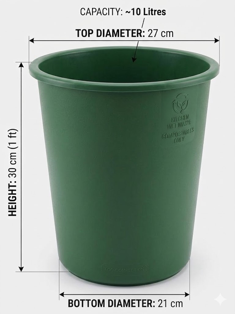
The Math: Accounting for virgin plastic raw materials, bulk injection-mold manufacturing, transport, and warehousing, a single blue mesh bin costs roughly ₹30 to produce, while a sturdy, solid green bin costs around ₹60.
The Subsidy: Rounded off, the actual manufacturing cost for a complete pair sits right at ₹100. For a state government already distributing a cash incentive of ₹1,000 per family as a Pongal gift, an additional expense of ₹100 is minuscule.
By subsidizing the cost—charging the citizen ₹50 and absorbing the remaining ₹50 as a targeted welfare measure—the household receives:
One blue open-mesh bin designed specifically for dry plastics and recyclables.
One sturdy green solid bin meant for kitchen wet waste.
This micro-investment completely alters user psychology. It removes the financial barrier for low-income households while ensuring that every citizen feels a true sense of ownership, because they paid for it.
Images generated using Gemini
Prioritizing Functionality Over Aesthetics
For a long time, home decor trends have dictated the look of household utilities. Plastic manufacturers design dustbins in whites, pinks, beige, and grays to match living room curtains or kitchen tiles. But when it comes to mass civic behavior, functionality must take priority over aesthetics. The state administration should advise and mandate plastic manufacturing companies to stick to strict, standardized color profiles for domestic waste bins. If households can only easily purchase green sturdy buckets and blue meshed bins in retail stores, it creates a universal visual language. No matter whose house you visit, blue always means plastic and green always means kitchen waste. This systemic uniformity makes it incredibly easy for the human brain to build a permanent, automatic habit.
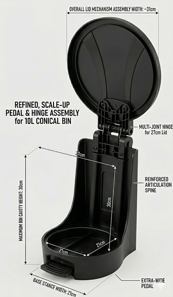
Smart Logistics: The “No-Lid” Stacking Strategy
One of the largest hidden failures of municipal rollouts is the sheer nightmare of logistics and transport. Shipping millions of fully assembled pedal bins to local Public Distribution System (PDS) shops requires enormous truck volumes, driving up carbon footprints and warehousing costs.
The solution is brilliant in its simplicity: distribute only the open-top conical bins through the PDS system. Because the blue mesh bins and green solid buckets are tapered, they can be easily stacked one over the other and stored in a fraction of the space, making mass transport to rural and urban ration shops highly efficient.
Where does the cover come from? The state administration can publish the standard dimensional blueprints of the bins (e.g., a standard 27 cm top diameter). Local plastic manufacturers and MSMEs can then produce matching lids and hands-free pedal assemblies to sell independently through local retail stores. Citizens who desire the premium convenience of a pedal lid can purchase it separately, fueling the local retail economy while keeping the government’s core distribution model lean and agile.
Images generated using Gemini
The Human Nudge: Empowering Our Sanitary Workers
Even with the right bins in place, old habits die hard. We have all seen waste collection vehicles blaring instructions on loudspeakers, yet many people still mindlessly hand over mixed garbage, often operating under the cynical assumption that all waste eventually ends up mixed together in the same landfill anyway. Loudspeakers can be ignored; human connection and clarity cannot.
The ultimate behavioral nudge happens right at the doorstep. When a municipal worker receives unsegregated waste, they should be empowered and trained to gently advise the resident on the spot, explicitly explaining the logistics of the operation: that the wet waste from their green bin is collected by a specific truck destined for composting, while the recyclable waste from their blue bin goes into an entirely separate vehicle headed straight for recycling. Human beings are deeply empathetic; while citizens easily tune out a recorded loudspeaker announcement, they listen, understand, and oblige when a hardworking sanitary worker looks them in the eye, clarifies exactly where their effort goes, and asks for cooperation. This brief, respectful request can bridge the gap between urban infrastructure and household empathy.
Focus First, Expand Later: The Phased Roadmap
A comprehensive waste management framework globally relies on multiple colors: Green for organic, Blue for recyclables, Yellow for medical/sanitary waste, and Red for hazards. However, attempting to teach a large population to sort four or five streams of waste all at once creates cognitive overload, leading to confusion and systemic failure.
Progressive governance dictates a phased roadmap. For Year One, the administration should strictly restrict the exercise to the two fundamental pillars of household waste: Green and Blue.
Mastering the separation of wet kitchen scraps from dry plastic wrappers forms the foundation of environmental literacy. Once this habit is locked into the daily routine of every household, the government can naturally expand the initiative in subsequent years, introducing Yellow and Red bins to handle sanitary and hazardous waste. Success is built sequentially, one habit at a time.
Flipping the Script: Changing the Political Narrative
When any government introduces a household cleanliness tool like a dustbin into a public welfare program, opposition groups can often attempt to weaponize it. A cynical narrative can easily emerge, claiming the administration is “handing out trash cans to its citizens.”
To neutralize political friction, the entire initiative must be wrapped in an inspiring, behavior-shaping narrative. The communication should explicitly move away from “waste disposal” and focus heavily on civic pride, health, and our deep cultural roots. Centuries ago, John Wesley remarked that “Cleanliness is next to godliness,” and Mahatma Gandhi famously stated that “Sanitation is more important than independence.”
Messaging Shift:
The Old Narrative:“The government is giving you bins to manage your garbage.”
The Inspiring Narrative:“This festive season, we aren’t just celebrating our harvest; we are investing in the soil that gives it to us. The Green and Blue bins are tools of citizen pride—a partnership between the state and the people to build a healthier, disease-free environment for our children.”
When presented as an upgrade to a time-honored tradition, the bins cease to be perceived as political commodities. Instead, they become a badge of civic responsibility.
The Ultimate Return on Investment: A Triple-Win for the State
Great governance is rarely about building the most complex, high-cost infrastructure; it is about designing an environment that makes civic virtue the easiest path to choose. By splitting the estimated ₹100 manufacturing cost of the two-bin system equally between a government subsidy and a citizen’s ₹50 co-payment, a state-wide rollout becomes incredibly affordable. This micro-investment triggers a massive chain reaction of benefits that easily pays for the project within its very first year.
First, the city experiences immense financial relief; receiving pre-segregated waste drastically slashes landfill transportation costs and “tipping fees” because clean dry waste can be routed straight to recycling streams while organic waste moves to processing plants. Second, it unlocks economic opportunities and revenue generation, transforming a municipal cleanliness department from a pure cost center into a value creator. Clean wet waste from green bins can feed compressed bio-gas (CBG) facilities to generate rich fertilizers for agriculture, while clean plastic from blue bins fuels local recycling industries, boosting green jobs. Finally, it creates a healthier planet. When food waste is buried mixed-up in a traditional landfill, it is starved of oxygen. This leads to anaerobic decomposition, which releases methane—a greenhouse gas over 25 times more potent than carbon dioxide at trapping heat. Proper source segregation ensures kitchen waste is aerated and composted safely, cutting down a city’s carbon footprint overnight while reducing the public health hazards of vector-borne diseases from open dumpsites.
Ultimately, transforming a festive gift into a shared social contract empowers everyday citizens to protect their environment—one household, two bins, and three seconds at a time.
P.S.Writing about dustbins, waste, and public distribution might feel like an unusually mundane topic for a policy discussion. But the intention of this post isn’t about garbage or to demean the citizens — it is about nudging behavioralchange in a respectful wayand as a shared responsibility, thereby aiming for a cleaner, healthier society.
Dustbin is how the container that is used to temporarily store and discard waste is called in India. Other countries use the terms like Trash can, Trash bin, Rubbish bin, Garbage can, Waste basket…etc.
*This blog post was refined using Gemini.
Addendum: The Institutional Nudge
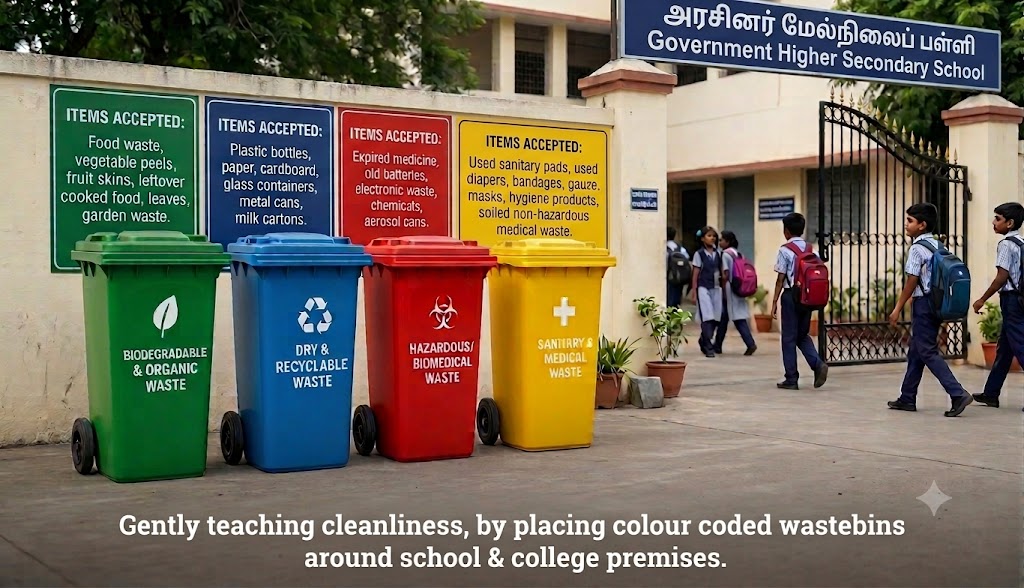
A comment from my school type Reji sir, about how civic discipline is hardwired into children, directly by their schools rather than at home, made me think: What if our education departments led by example?
Instead of treating cleanliness as an abstract textbook lesson, what if the Department of School Education and the Department of Higher Education nudged campuses to install standardized, color-coded bin stations with clear instructional boards. Leading by example, with this physical infrastructure can make source segregation an automatic, daily reflex and a life long behaviour.
Change begins at home, and is polished in classrooms.
“That which we obtain too easily, we esteem too lightly.” — Thomas Paine
There is a fundamental quirk in human psychology: what is given too freely is almost always valued too cheaply. When the price tag of a commodity or a gesture drops to absolute zero, its perceived value often plummets with it.
We see this play out constantly, from macro-level government policies to corporate boardrooms, and even in our closest neighborhoods.
1. The State Government Dilemma: Welfare vs. Worth
Over the years, successive state governments have rolled out massive welfare schemes distributing free televisions, fans, mixers, and grinders. This isn’t a critique of social justice—welfare has its place. However, the execution exposes a flaw in how we perceive free items.
Walk into second-hand shops, and you will find piles of these pristine, government-issued appliances. Many recipients sold their free TVs immediately—some even packaged them off to student hostels in neighboring states for quick cash.
The psychological shift happens at the price point. If the government had charged even a token amount—say, ₹100—the public narrative would have changed. It would no longer be “free junk”; it would be a heavily subsidized asset worth protecting.
The Concept of ‘Skin in the Game’ through Civic Action If charging a nominal financial fee is politically or logistically impractical for a welfare scheme, the state can introduce cost through a different currency: personal accountability. What if freebies or social security benefits were linked to conditional milestones?
For instance, to qualify for a government benefit, a citizen might need to demonstrate that they have bought a basic term insurance policy to insulate their family from sudden poverty, or drafted a legal will to eliminate generational property disputes. By introducing these nudges, the government transforms a passive handout into an active tool for social engineering. It forces the recipient to think about long-term stability, ensuring that while the benefit is free, the right to access it requires a meaningful commitment to their family’s future.
2. The Corporate Cafeteria: From Gratitude to Grievance
Step into the corporate world, and you see the exact same behavior. Many top-tier companies offer lavish, free buffet meals to keep their employees fueled and happy. Yet, day after day, you can hear employees cribbing about the menu options or the salt levels.
Constructive feedback is healthy, but habitual complaining about a premium, free benefit is a symptom of entitlement.
The reality is, nobody is forcing employees to eat at the office cafeteria. It is an entirely optional perk. If someone feels that the free meal doesn’t cater to their specific taste, they are well within their rights to bring food from home or eat elsewhere. Blaming the company for a voluntary benefit makes little sense.
Now, imagine if the company priced that exact same buffet at a nominal ₹5. Instantly, the psychological context flips. The narrative changes from “This free food is mediocre” to “Wow, where else on earth can I get a massive, delicious buffet for just five rupees?”
There is an old, wise saying that applies perfectly here: “Don’t tell the person carrying you up a hilltop that they smell bad. If you don’t like it, get down and walk.”
3. The Commute Complaint: Nodal Points vs. Entitlement
This psychological blind spot doesn’t stop at the cafeteria; it extends right into the office transport bay.
Consider a company that provides free, air-conditioned cabs for employee pickups and drops. To keep commute times efficient and fair for everyone, the transport department asks employees to walk a few meters to a designated “nodal point” on the main road. It makes logical sense: navigating narrow residential streets during peak-hour traffic delays the entire cab and inconveniences everyone else on board.
Yet, rather than walking those few short steps or choosing to commute using their own vehicles, many employees still crib about the service. They overlook the massive financial and logistical burden the company is lifting off their shoulders.
What makes the complaining even more unreasonable is that the company does provide doorstep drops during night shifts or pre-dawn pickups to ensure safety. But during normal hours, when the policy is optimized for the collective good, the concept of a “free ride” makes people focus entirely on their minor inconvenience rather than the major benefit.
Once again, when a premium service costs zero rupees, our expectations skyrocket to unreasonable heights.
4. The Neighborhood Lesson: When Charity Hurts Self-Esteem
Perhaps the most profound example of this happens at a deeply personal level, where giving freely can inadvertently hurt the very person you want to help.
In my village, a neighbor rented a small room to a daily wage laborer for ₹800 a month. When a member of the tenant’s family developed a severe kidney complication, the medical bills broke them. Seeing their struggle, the kind-hearted house owner waived their rent for two months to let them recover.
Instead of being relieved, the tenants abruptly packed their bags and vacated the house. The house owner was stunned. Why leave when someone is actively trying to support you?
What he later realized was a masterclass in human dignity: living entirely rent-free had severely bruised the tenant’s self-esteem. Furthermore, they carried the crushing anxiety that the neighbors would look down on them as objects of charity. By trying to eliminate their financial burden entirely, the house owner had inadvertently created a psychological one.
The Takeaway
Human beings are wired to equate cost with commitment. When we pay nothing, we invest nothing—neither our gratitude nor our respect. Whether you are running a state, managing a corporate team, or helping a neighbor, sometimes the best way to preserve someone’s dignity and value for what you offer is to ensure they have skin in the game. Sometimes that means charging a token financial price; other times, it means demanding a baseline of personal accountability and civic action. True value is never found in a passive handout; it is forged when we are asked to invest something of ourselves in return.
What are your thoughts on this? Have you ever noticed a situation where giving something away for free completely changed how people valued it? Let’s discuss in the comments below!
P.S. This post is purely a psychological observation on human behavior; it is not a critique of social justice schemes or the intentions of kind-hearted samaritans.
In my childhood, while visiting my uncle’s house in Erode, my father would always point out the sights as we passed through the central bus stand or by the district collectorate. He loved to praise how neatly planned and massive the bus stand was, and how tall the collectorate building stood. He always credited this development to a past minister in the MGR cabinet, who had transformed his constituency by bringing in the bus stand, the collectorate, and the IRTT engineering and medical colleges. It was a clear, inspiring example of how an elected representative can contribute positively and transform his constituency.
But as I grew older, I realized how difficult it is for an ordinary citizen to track what each elected representative has actually done for his constituency across different tenures. In a modern democracy, we shouldn’t need a Right to Information (RTI) application just to see what our representatives are doing. Accountability should be proactive, not reactive.
In 2019, I shared “A Common Man’s Wish List for Good Governance,” where I dreamt of portals like fundsandspends.gov.in. Today, I want to evolve that wish into a technical reality: The Transparency Stack. This is a roadmap for the new government to move accountability from the cupboard to the cloud/computer, scaling tracking from the village ward all the way to the Legislative Assembly.
Part 1: The Manifesto Tracker (Pre-Election)
Accountability begins before the first vote is cast. Currently, manifestos are treated as marketing brochures that vanish after polling day. We need to turn them into Digital Contracts overseen by the Election Commission.
The Database of Manifestoes: Parties and candidates should submit their manifestos in a standardized data format to be displayed transparently on the official Election Commission website.
The Funding Logic: For every major promise (e.g., “Free electricity”), parties must disclose the estimated budget and the source of funds. Will it come from new taxes, a reduction in other subsidies, or increased public debt?
Targeting & Timeline: Each promise should explicitly define its target demographic (farmers, students, SMEs), the Nodal Ministry responsible, and a clear implementation timeline (e.g., a “100-day plan” vs. a 5-year project).
Institutional Memory: Digitization ensures these promises aren’t swept away once campaign rallies end.
Part 2: The Transparency Dashboard (From MLAs to Ward Members)
Once a government takes power, we need to track the “Rupee Trail.” To kick this off, the government can launch a Minimum Viable Product (MVP) focusing on an MLA fund tracker, partnering with civic tech organizations like the eGov Foundation and leveraging the open-source DIGIT platform.
The MVP dashboard could look like this:
Constituency
MLA
Funds Allocated
Year
Projects Implemented
Funds Utilized per Project
Contracting Firm
Firm Directors
Remaining Fund Balance
Erode East
Name
₹3 Crore
2026
Link Road X
₹45 Lakhs
ABC Infra Ltd
Mallika, Sundar
₹2.55 Crore
Vertical Scaling: Once fine-tuned, this digital infrastructure should scale upward to MPs and downward to Local Bodies. A citizen should be able to see the exact fund allocations and expenditures for their Panchayat President, Union Chairperson, and Ward Councilor.
The Citizen Wishlist: We must move beyond passive data viewing. Citizens should be able to “pin” hyper-local needs—like “Need a bridge at X location,” “Primary Health Center needs staff,” or “Need streetlights at Y street.” This builds a data-driven priority list for elected officials, replacing guesswork with the community’s true needs.
Part 3: The Public Cost Center (Which department is responsible?)
In the corporate world, every project, expense, or hire is tied to a Cost Center. You always know who the financial sponsor is. In public life, when we see a broken road or a failing utility, citizens are caught in a classic “blame game” between the MLA, the Ward Councilor, and the executive bureaucracy.
The Transparency Stack solves this by assigning a Digital Cost Center to all public infrastructure assets through QR-code asset tagging. Scanning a QR code on a street sign or water station would instantly reveal:
The Sponsor: Was this funded by the MLA fund, an MP grant, or a municipal budget?
The Executor: Which specific department (PWD, Corporation, TWAD board) owns the asset?
The Point of Contact: The name and office contact details of the specific Executive Engineer responsible for its upkeep.
Part 4: The Waste Watch
We have all witnessed perfectly good roads being re-laid after just six months, or pristine flyover pillars covered in expensive “plaster of paris decorations” simply to exhaust an annual budget and trigger kickbacks through the contractor-official nexus.
Redundancy Audits: The dashboard should automatically flag projects that overlap with recently completed work. If a road was laid recently, the system should block “re-laying” funds until an independent audit justifies the need. News Ref.
Part 5: The Reality Check
Governance frequently happens through grand promises at rallies and signed papers in corporate boardrooms. It must be actively verified on the ground to monitor implementation.
The Announcement Tracker: By utilizing AI to parse public speeches, the system can log stage promises (e.g., “I will build a stadium here”) as a “Pending Task” on the representative’s profile. The public can track whether an official Government Order (G.O.) follows the applause or if it was just rhetoric.
MoU Transparency: When the state signs high-profile Memorandums of Understanding (MoUs) with business corporations, the public deserves a “Conversion Tracker” showing if those corporate signatures genuinely translate into factories, local investment inflows, and jobs.
Why this matters?
When we make the data public, every citizen, regardless of their political awareness, can see a “Governance Scorecard” for their representative. We do more than just fight corruption; we honour the legacy of those leaders who actually did the work. As expressed in my 2013 blog post, a better nation is built with well-informed citizens. The Transparency Stack is the architectural blueprint for that information. By digitizing the lifecycle of a promise—from the manifesto to the ward-level funds & spends, we move from the “politics of rhetoric” to the “politics of performance.”
We aren’t just building a dashboard; we are building a smarter democracy. It is time we stop asking “What has my MLA done?” and start seeing it right on our screens.
What do you think?
Should such an accountability dashboard also include a “Citizen Rating” feature for completed infrastructure projects? What specific feature do you think would help citizens monitor their neighborhoods better? Please let me know your thoughts in the comments below!
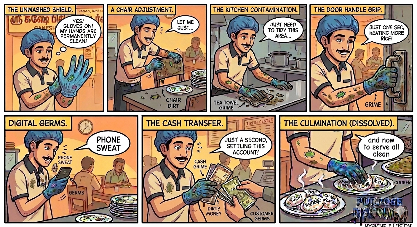
We’ve all seen it. You walk into a busy tiffin center or a local cafe, and you feel a momentary sense of relief. The server is wearing bright blue or clear plastic gloves. “Ah,” you think, “they care about hygiene here.”
Then, the illusion shatters.
With the gloves on, the server wipes a grime-streaked counter with a damp, dirty tea towel. They accept a sweaty currency note from a customer. A notification pings—they tap away at a smartphone screen. They might even adjust their face mask, pull a chair for a guest, or grab a water bottle by the cap. Finally, they reach out and pluck two steaming idlis from the steamer to place them on your plate.
Purpose dissolved. The purpose of hygiene and why a glove is worn, has been forgotten.
The Hand Glove Illusion. Graphics generated using Gemini.
The “Magic Shield” Fallacy
The primary issue is a fundamental lack of understanding of what a glove is for. Many staff members treat gloves like a magical barrier that keeps their hands clean, rather than a tool to keep the food safe.
The Reality: Bacteria don’t care if they are hitching a ride on human skin or latex.
The Irony: A person with bare hands is more likely to feel the “stickiness” of dirt and wash their hands. A person in gloves feels “permanently clean,” leading to a dangerous lapse in sensory awareness.
The Invisible Path of Contamination
In the food industry, “Hygiene Theater” creates a trail of germs across every surface:
The Multi-Tasking Towel: Using gloves to handle a “tea towel”—which is often a breeding ground for bacteria—and then returning to food service.
The Currency Exchange: Currency notes are arguably one of the dirtiest objects in circulation. Using a gloved hand to handle cash and then immediately touching “ready-to-eat” food is a direct bypass of all safety protocols.
The Digital Contaminant: Phones are high-touch surfaces covered in germs. Checking a message mid-service “dissolves” the hygiene of the glove instantly.
The Infrastructure Trap: Every time a gloved hand touches a door handle, a POS terminal, a refrigerator grip, or a customer’s chair, it collects a new layer of contaminants.
Reclaiming the Purpose
If the glove doesn’t change when the task changes, the glove is the problem, not the solution. Proper hygiene isn’t about wearing the gear; it’s about understanding the flow of contamination.
The Golden Rule for Food Safety:
“A glove is only as clean as the last thing it touched.”
If a server touches a phone, a currency note, or a cleaning rag, those gloves are now “dirty.” They must be discarded, the hands underneath must be washed, and a new pair must be donned.
Another Practical Hack: The “Dominant Hand” Strategy
If we want to stop the cycle of cross-contamination, we have to work with human nature. Perhaps the answer isn’t more gear, but better design.
The Proposal: Glove the Non-Dominant Hand.
Since most servers are right-handed, their right hand is instinctively used for “utility tasks”—counting cash, opening doors, or handling tea towels. By keeping the right hand bare, the server retains their sense of touch and remains aware of when their hand is actually “dirty.”
Meanwhile, the left hand is gloved and reserved exclusively for touching food or clean plates.
Why this works:
Intuitive Separation: It’s easier to remember “Left for Food, Right for Everything Else” than to remember to change gloves twenty times a shift.
Tactile Feedback: The moment the bare right hand touches a greasy surface, the brain receives a “dirty” signal. That instinct to wash is lost when the hand is encased in plastic.
Reduced Waste: This method uses half the number of gloves while providing significantly higher actual safety.
Final Thoughts
Hygiene isn’t a costume. If your staff is wearing gloves but still touching everything in sight, you aren’t protecting your customers—you’re just performing “Hygiene Theater.” Let’s trade the “Glove Habit” for “Hand Awareness.” Whether it’s through the dominant hand strategy or frequent, visible handwashing, let’s ensure the purpose of food safety is no longer dissolved, but strictly upheld.
I’d love to hear from you:What is the most “purpose-dissolving” thing you’ve seen a gloved server do while preparing your food? Do you think the One-Hand Rule would work in our busy local tiffin centers, or is there a better way to stay safe?Drop your stories and thoughts in the comments!
Note from the Author: This post isn’t about pointing fingers at the hardworking individuals who feed us every day. We have immense respect for the long hours and dedication of restaurant staff. Instead, this is a look at how a lack of specific hygiene training can turn a good intention into a safety risk. Let’s move from “hygiene theater” to true food safety, together.
PS: The credit for the title “Purpose Dis(solved)” goes to my former colleague, Mr. Dhanasekar. He originally used the phrase on his blog, Testing Ideas, years ago. I felt the wordplay perfectly captured the “dissolving” hygiene standards I witnessed here.
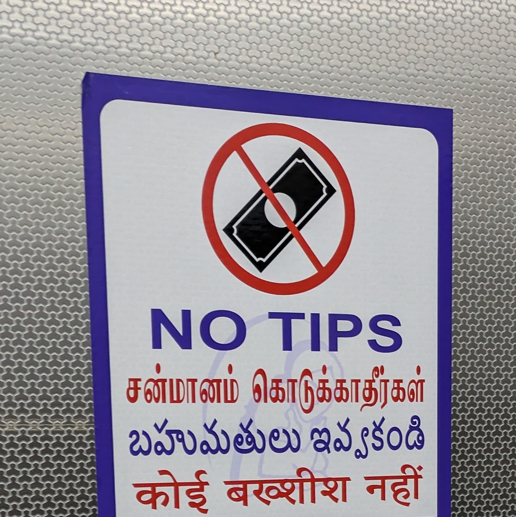
A sign I found in a hospital lift. A quiet but powerful statement about professional labor.
On this Labour Day, as we celebrate the rights and dignity of workers across the globe, I found myself reflecting on a simple, powerful sign I saw in a hospital lift: “NO TIPS.”
This sign doesn’t just represent the hospital policy; it represents an entire culture’s approach to labor. It implies that the staff are professionals whose livelihoods are already secured by their employer. It is a perfect “Labour Day” reminder to reflect on a global habit that causes anxiety for many: Tipping culture.
During a recent training on cross-cultural sensitivity, I encountered a fascinating contrast. In the United States, college students often take up part-time service jobs and rely almost entirely on tips to pay for their tuition and housing. Conversely, in India—where parents typically cover college and hostel fees—hotel waiters are usually full-time employees who receive a steady wage and complimentary meals. This realization brought me back to a fundamental question: Why is the customer responsible for the employee’s livelihood?“
The “Postman” Logic
Consider your local postman, often delivering mail through harsh weather and long hours. When we receive a letter, we don’t feel a moral obligation to tip them. Similarly, when we board a flight, we don’t tip the pilot. Why? Because we recognize that their employers—the organizations profiting from their labor—are responsible for their livelihood. Yet, in the hospitality industry, particularly in the West, this logic is flipped. The ‘tip’ has shifted from being a reward for exceptional effort to a mandatory subsidy for underpaid staff. Why should a server be the only professional denied a guaranteed wage and forced to depend on the whim of a customer?
Why “Forced Tipping” Fails the Worker
While tipping is often framed as a “choice,” the current system actually puts the worker at a disadvantage:
Income Instability: A worker’s ability to pay rent shouldn’t depend on how many people walked through the door on a rainy Tuesday.
The Burden of “Gratitude”: It forces service staff to “perform” for their pay, creating an unhealthy power dynamic between the customer and the server.
A Lack of Transparency: If a meal costs $20, but I am socially obligated to pay $25 to ensure the staff can eat, then the menu price is a lie.
Many countries around the world operate successfully without a tipping culture. In these societies, the cost of labor is built into the price of the product. The result?
Workers have predictable incomes.
Employers take full responsibility for their payroll.
Customers enjoy their experience without doing mental math at the end of the night.
The Way Forward
Supporting “no-tipping” isn’t about being ungenerous; it is about advocating for a more professional and equitable workplace. An employee’s wages should be a contractual guarantee, not a gamble based on a customer’s mood.
This Labour Day, let’s advocate for a world where “service with a smile” is a sign of a well-treated professional, not a survival tactic. It is time we stop tipping the balance and start paying the wage.
Should the employer pay fair wage, or should the customer tip? What if the restaurants displayed a sign like the one below? What are your thoughts? Please share in the comments. Thank you 🙂
* The above images generated using Gemini. This blog post has been refined using Gemini.
We’ve all been there. You’re in a high-end hotel or a trendy “concept” restaurant. You head toward the restrooms, only to be met with two stylized, abstract symbols. One looks like a triangle; the other looks like an inverted trapezoid. We wonder: “Should I use the door with a triangle or a trapezoid ?” Is the door with the “High Heel” for women, or is it just a fancy shoe store? Does the door with the “Pipe” mean men, or is it a smoking room? We feel like we’re suddenly being forced to solve a riddle. When you’re in a hurry, you don’t want to play a guessing game. You just want to know which door is yours.
In our quest to make every building look “modern” or “stylish,” we have forgotten the most basic rule of design: Don’t make the user think. A restroom sign shouldn’t be a piece of art; it should be a clear instruction that anyone—a child, a tired traveler, or a senior citizen—can understand in less than a second.
As someone passionate about User Experience (UX) and Usability, I find this trend of prioritizing “aesthetic style” over “functional clarity” deeply frustrating.
The Problem: When Creativity Causes Confusion
In the world of design, there is a golden rule: Don’t make the user think. When designers use “creative” signs—like a pipe vs. a high heel, or a rooster vs. a hen—they are adding unnecessary cognitive load. For a local, it might be a smirk-worthy joke. For a tourist, a child, or someone with a visual impairment, it’s a barrier.
I’ve often wanted to photograph these “design fails” to document them, but let’s be honest: taking photos of bathroom doors in public is a quick way to get a visit from security. The optics are terrible, even if the intention is purely for a UX case study!
The Universal Solution: Clarity Over Cleverness
If we want to create a truly inclusive and usable environment, we need to return to standardization.
While the modern world discusses unisex spaces, we must design for our specific cultural and safety contexts. In India, clear differentiation isn’t just about tradition; it’s a matter of privacy, safety, and comfort. To prevent confusion or the exploitation of “grey areas” in signage, a universal standard is the most effective tool.
My Proposal for the “Universal Sign”:
Color Coding: Utilizing high-contrast colors that are instantly recognizable (e.g., Blue for Men, Pink/Maroon for Women).
Clear Lettering: Bold, sans-serif letters like ‘M’ and ‘F’.
Iconography: Using the standard ISO human figures that are understood regardless of the language you speak.
Why Functionality Must Win
A bathroom sign is not a piece of art; it is a navigational tool. 1. Accessibility: People with low vision or cognitive disabilities rely on familiar shapes and high contrast. 2. Emergency: No one wants to “interpret” art when they are in a rush. 3. Safety: In a country like India, clear boundaries help maintain social order and ensure that women feel secure in public spaces.
Final Thoughts
To the architects and interior designers out there: By all means, make the hallway beautiful. Choose the finest marble and the warmest lighting. But when it comes to the door handle, please—just tell us which room is which.
The best design is the one that disappears because it worked so perfectly you didn’t even have to think about it.
*The post is being refined with more examples and designs
Fifteen years ago, an unusual wedding invitation landed in my inbox. The subject line was “Are you invited?” It was from my Sainik School friend, Jagan & I still think about it today.
Jagan was a young rebel influenced by the teachings of Vethathiri Maharishi. His reasoning was not to blindly follow “illogical” traditions. He felt marriage function these days are the saddest moments for the parents from middle class & below middle class and questioned why families spend a lifetime’s earnings on a single day to impress relatives who often leave the hall with a quiet envy or lingering comparison rather than blessings from the heart. Why are they subtly forced to buy enormous gold jewels? Why do we invite 1000s of people for the wedding, if the people who really care and matter in our life might be just a handful?
The kicker? He explicitly told friends: “I am not gonna invite any of you.” He wanted to save that money for orphans and the starving. While he eventually had to compromise for his bride’s sake, his logic planted a seed in me: Why do we force ourselves beyond our financial capacity, to impress others? Are we too status driven?
1. The Hidden Cost of Social Comparison
Fast forward to today. This pressure to match expectations hasn’t disappeared; it has simply migrated to social media platforms like Instagram and Facebook.
I recently watched a video by Food Pharmer regarding the “Reality of Kid’s Birthday Parties.” He hit the exact same nerve Jagan did in 2009. We often see parents hosting elaborate first birthdays—designer cakes, professional crews, and wedding-level decor—for a one-year-old who won’t even remember the day.
As Food Pharmer noted, these grand gestures are frequently driven by our modern digital culture. We are no longer just celebrating a milestone; we are subtly feeling the pressure to compete in a digital arena, spending resources to fulfill social expectations.
2. The Psychology of the External Validation
Long back, I was reading a series of articles by a psychologist in a Tamil weekly, which helped me understand why people resort to show-off.
She explained that students who study well and get good grades are generally quiet and polite because their confidence and self-esteem are inherently high. Because they feel secure in their reality, they don’t feel the need to loudly prove themselves. Conversely, students struggling with poor grades often resort to louder, attention-seeking behavior as a psychological mask for their fragile self-esteem.
This doesn’t end at graduation. When we feel an unconscious deficit in our internal self-worth, we sometimes use extravagant displays—whether it is a massive wedding, a luxury car, or a hyped birthday party—to signal success to the outer world.
High Self-Esteem allows us to be content with simplicity because we have nothing to prove.
Low Self-Esteem often seeks a stage, a spotlight, and external approval to feel valid.
3. The Math of Freedom
This leads us to a profound truth recently shared by a financial analyst: If you have a good income and reduce your tendency to unnecessarily impress your neighbors, you can reach financial independence in a shorter duration of the time.
Every rupee spent on creating a “perfect image” for someone else’s eyes is a rupee taken away from your own future freedom.
The Status Choice (Short-term High)
The Freedom Choice (Long-term Peace)
1,000 guests to avoid “What will people say?”
50 loved ones; Invest the rest in an Index Fund.
Designer birthday themes for social media updates.
A day at the park; Adding to the child’s education fund.
Upgrading a car just to match the neighbors.
Driving a reliable car; Buying back your time and peace.
Be Brave Enough to be “Boring”
Jagan’s “non-invite” was a gift. It wasn’t about being rude; it was a reminder that we don’t owe anyone a performance of our success.
True wealth isn’t about having the most expensive decorations or the loudest celebrations; it’s about having the peace of mind to know you are financially secure and your family is genuinely happy.
Before making our next big spend, it is worth asking ourselves a gentle question: “Would I still choose this if I couldn’t share it with the world online?”
If the answer is no, perhaps the best investment we can make is to keep our money, protect our peace, and buy our freedom instead.
P.S. Walk into some Indian homes, and you will likely find multiple wall clocks, stackable travel bags, and identical photo frames—some hanging up, but many lying idle on top of the bero (cupboard). These are the lingering artifacts of marriage gifts. Social compulsions often drive guests to buy these standard items. But when ten different people gift the exact same thing, the excess simply gathers dust for years before wearing out.
Contrast this with the traditional Tamil concept of Moi (மொய்). In the olden days, guests gifted money, which was meticulously noted down in a ledger. The newly married couple could use this collective fund to comfortably buy exactly what they needed to set up their new home, without pinching their pockets. Down the line, they simply returned the favor by gifting the same amount back when attending a function at the sender’s home. It was a beautiful, practical cycle of mutual financial support—proving that our ancestors understood functional utility long before we traded it for empty, repetitive gift-giving.
*This blog post has been refined using Gemini. Note: This piece is not intended to hurt or discourage those who have the financial means and wish to spend generously on special occasions for their loved ones. It is simply written as a gentle reflection for those who feel societal pressure to go desperately beyond their means.
Online reviews have become the go-to resource for everything—from buying gadgets and booking hotels to choosing training courses or restaurants. But are these reviews always trustworthy? In a digital world flooded with ratings and testimonials, many of us have discovered the hard way that not all five-star reviews are created equal. This post explores how incentives, outdated information, and persuasive advertising often skew online ratings—and why the opinions of people you know can be far more reliable.
Case Study 1: The Paid Review Trap When Nivetha decided to restart her career, she turned to online reviews and picked a two-day classroom training. The fee was steep, but the 4.8/5 rating convinced her it was worth the investment. The training promised value but delivered something she could have learnt through Wikipedia or for free online. Disappointed, she realized the classes were not worth the money she had paid for. What puzzled her most was the glowing online ratings. The answer arrived the next day—she received an email: “Give us a 5-star review, and you’ll get a ₹500 voucher.” The incentive was tempting, but Nivetha questioned the ethics: were the stellar ratings genuine, or had they been bought?
What went wrong? It’s easy for a person to be swayed by a small incentive. The reward for 5-star ratings had distorted the online reviews and also misleads future customers, making them unreliable and undermining the credibility of feedback.
Case Study 2: When Awards Can’t Be Trusted Ria was driving on the highway when she noticed something peculiar: multiple billboards for different car brands, each proudly claiming the “Car of the Year” award. She knew various publications and organizations give out their own awards, but it still made her wonder—how can they all be “the best”? A few weeks later, she found a clue. An email from a marketing firm offered her company an award in a specific category, but only if they paid a fee that could be “clubbed as part of the marketing budget.” This practice, often called “pay-to-play,” instantly made her realize that the accolades she’d seen on those billboards might not have been earned at all. A practice that misleads consumers into believing a company or product has been genuinely recognized for its excellence.
Case Study 3: The Friend Factor Vishnu’s experience buying his first car was another lesson. An emotional milestone, he did his research online and was drawn in by relentless ads touting a particular model’s 5-star safety rating. He was ready to buy it until a lunch conversation with colleagues changed his mind. Babu, who already owned that model of the car, confessed he was unsatisfied with the quality of interior parts and the engine and the positive online publicity the car had received was a job done well by the marketing team. He advised Vishnu to consult Gopi, a car enthusiast whose recommendations were based on real-life experience. Gopi’s thoughtful advice helped Vishnu find the right car for his needs.
Your friends’ honest opinion trumps a thousand 5-star reviews.
Case Study 4: Advertising and Authenticity Manish ran into similar trouble when he searched online for office chair & desk to setup his home office, during the Covid lockdown. Soon, he was bombarded with polished online ads and enthusiastic testimonials. Manish purchased the chair and desk, only to discover a few weeks later that they were poorly made and falling apart. A few days later, in the office lunch table, another colleague, Subha was asking for opinions to buy an office chair and mentioned the ads she saw from same company Manish had purchased. Manish was fuming because he fell for a wonderfully crafted advertisement and strongly suggested not to purchase that chair. Hearing this, another colleague recommended a chair he was using for years, and was of good quality and affordable. Subha made her purchase based on recommendation from a trusted friend and found it good. Manish & Subha now trust & ask suggestions from friends, colleagues, or through alumni WhatsApp groups before buying something or eating out, rather than relying on online reviews.
What went wrong? Persuasive advertisements & suspicious testimonials lured Manish into buying a poor quality product.
Case Study 5: Old Reviews and New Problems Arthy’s attempt to treat her guests at a local restaurant, based on positive reviews online, ended in disappointment. When they went, she was upset that neither the food nor the ambience lived upto the hype the reviews had promised. Talking to her friend later, she learned the restaurant had changed management years earlier and quality had dropped since. She also noticed how the restaurant staff placed a small card with QR code, politely asking her to leave a 5-star review.
What went wrong? Outdated reviews misled Arthy and the restaurant’s aggressive solicitation of high ratings further distorted the truth.
Case Study 6: The Malicious Competitor Shan, the owner of a popular cafe, is facing a problem many small business owners dread: fake negative reviews. A jealous competitor has orchestrated a campaign to sabotage his reputation. The competitor has enlisted friends and acquaintances to write scathing reviews on various online platforms, even though they have never set foot in Shan’s cafe. These reviews are not based on any real experience; they are a calculated and malicious attempt to drive down his star rating and mislead potential customers. This case highlights how online review systems can be exploited not only by unethical businesses but also by malicious competitors who weaponize fake reviews to undermine a rival’s success.
Case Study 7: The Vacation Membership Trap Karthik was sold on a dream: a lifetime of luxury family holidays at prestigious resorts. Lured by glossy advertisements showing serene resorts and happy families and a high-pressure sales presentation, he invested several lakhs into a long-term holiday membership. He was imagining effortless annual getaways, but the reality was a nightmare. Every time Karthik actually had vacation days, the app showed “Zero Availability” for his desired resorts. The beautiful rooms he saw in the ads existed, but they were out of his reach when he actually needed them. To his frustration, he noticed the same “fully booked” rooms were often available for the general public on websites like Booking.com or Agoda—but at a premium price. He soon realized he was part of an “Inventory Gap”—where the number of members far exceeds the number of available rooms. The financial drain didn’t stop at the initial fee. Karthik was hit with a mandatory “Annual Subscription Fee” that increased every year. He had to pay this fee even in years when he didn’t use the membership at all. When he finally managed to book a remote resort, he found himself in a “Food Trap”—since the resort was far from town, his family had to pay five-star prices for every meal, often doubling the cost of the “free” holiday. Now, he’s trying hard to transfer his membership, realizing that a beautifully marketed lifestyle is useless if you can’t actually use it, when you need it.
What went wrong? Karthik fell for glossy advertisement that sold a “dream,” without checking the real-world booking experiences of long-term members He traded the simple flexibility of a hotel booking for a rigid, one-sided contract. Between the “subject to availability” fine print, the hidden burden of rising annual fees, and the difficulty of transferring a membership, he realized that a beautifully marketed lifestyle is no luxury at all or indeed a burden if it dictates exactly when and where you can breathe.
Whether it’s a 5-star rating bought with a gift voucher, a testimonial from an anonymous user, or an award paid for by a company, the goal is the same: to create a perception of quality that might not exist in reality. Nivetha, Ria, Vishnu and Manish learned that a manufactured reputation, built on awards or paid endorsements, is no substitute for genuine quality. The best way to know if a product is truly excellent is to rely on the trusted, real-world experiences of people you know.
User Reviews – which began as a system designed to build trust and attract more visitors has now become unreliable, compromised by vested interests and manipulative practices.
How Might We Make Online Reviews Trustworthy?
Implement a “Re-Review” Nudge: What if, after posting a review, users received a gentle nudge a day later—asking if their review was genuine or incentivized, encouraging them to rethink or edit if necessary.
Ask Better Questions: A one-time visitor to a restaurant might give a good review, but a repeat customer is a sign of true satisfaction. Asking a question like, “Will you come back again?” could better gauge a customer is really in love with the food or service. Some relevant options like “Just came to explore” or “Came here for the Instagram worthy ambience” can help filter out one-off, potentially incentivized reviews.
Question Incentivized Reviews: Look critically at testimonials rewarded by discounts or vouchers, and be wary of ratings that seem unusually positive.
Check Review Dates: Verify that feedback is recent and relevant to avoid being misled by outdated comments.
Rely on Your Network: The most trustworthy reviews come from people you know. Your friends, colleagues, neighbors, alumni groups and trusted communities are far more reliable sources of information than a faceless online rating. They have no incentive to lie and can offer personalized advice based on their own experiences. The next time you’re tempted by five-star ratings, reach out to someone you trust – someone with real skin in the game.
Share Honest Feedback: When we write reviews, let’s pledge to be honest & transparent about our experience and help others make informed decisions.
Have you ever been misled by fake reviews? Share your experience in the comments below, and let us know what could have helped you make a better choice. Thank you 🙂
The reviews you can really trust, come from the people you know.
*Thanks to Pari, Ravi, Ajeeth & Vidhya for reviewing the draft of this post & for the early feedback. *This blog post was refined using Gemini & ChatGPT
The ones who shine a bit brighter, the ones who are maverick, the ones with lots of energy and charisma.
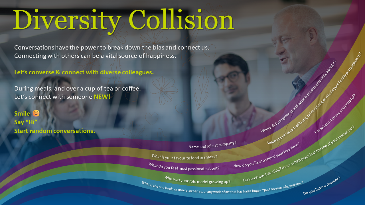
Felt good to be part of a program “We are LimITless.” The phase-2 of the culture journey focused on building a cultureofcollaboration by expanding your network. Why do we need to expand our network?
Collaborating effectively and working well in a matrixed organisation is crucial to achieve collective goals and progress. When we only reach out to people we know, for advice & support, we are limiting ourselves to same team, same routine and missing out on the diversity of opinion & perspectives, thereby slowing down on innovation process. By expanding our networks within the company, we increase our exposure to fresh perspectives, new ideas, opportunities and insights, build new skills and grow our self-confidence.
Volunteered to be a culture influencer, running a few experiments with support of org’s toolkit. In one of the experiments, we nudged & reiterated the teams to try Diversity Collision.
A few more experiments were, networking at leisure, pair and share, scheduled networking, sense checking with someone before presentation or sending a mail, discover hidden value about a colleague, happy-to-help, mentor-mentee and crowdsourcing.
Below are a wealth of resources that will help you network better and collaborate. In case you do not have subscriptions to the respective publishers, you might be allowed to read 3-5 articles free, per month.
Please click & expand for a wealth of resources & references:
A few years back, at the Construkt fest, I witnessed an induced networking called “Construkt Collision.” The hall was filled with people, standing. When the conductor of the event says, “Change,” every 1 min, we say “Hi” to the person around us, briefly introduce ourselves and also get to know the other person, exchange business cards, until we hear the next “Change,” after which, we move and meet someone new. It was interesting.
During the “Power of Diversity” week celebration at office, wanted to try something similar, help people meet diverse colleagues they haven’t interacted with and we came up with “Diversity Collision.”
I felt we were not able to achieve active participation in this collision probably because colleagues were shy to reach out to people they do not know or have never interacted with. To overcome this, in one of the offsite gathering, we requested the host to announce and nudge participants to sit alongside someone they have never interacted with and when breaking for lunch, to share the lunch table with someone new and get to know them better. Slight force or nudge helped to break the inertia/shyness 🙂
In hindsight, I thought, we also could have also tried placing a bingo sheet on colleagues desks and asked them to meet, interact briefly and get signatures or names of people, under questions/options like:
Someone born in specific month
Someone wearing a particular colour shirt
Someone from another state/country than yours…etc.
Jay drives to the petrol bunk and requests petrol refill of Rs. 1000 to his car.
The attender refills and asks the mode of payment.
Jay says UPI, scans a QR pasted near the pump pillar and sends money.
The attender interrupts and annoyingly asks why he sent the money through that QR. The attender then said Jay needs to scan the QR from a card board he was holding onto his hand, which had a QR printed in A5 sheet and pasted.
Looks like the petrol bunk has different modes of UPI payment. This is apart from cash and card payments.
Some QR payments are processed through the petroleum companies payment gateway
Some QR payments are processed through the petrol bunks bank account
Some QR payments go directly to the petrol bunk owners bank account
The QRs were, either pasted on the dispenser or printed and held on hand or printed to plastic holders supplied by payment aggregators or generated through the POS machine. There is some confusion and delay in processing the payment. The next vehicle waiting is honking.
How might we enable faster & easier UPI payments at petrol bunks?
I could think of a user feedback from the office tea stall:
“Do you feel, opening the app at tea stall, adding the amount and then entering the PIN, a painful process? The user says, he is used to it daily and it feels like a ritual. While he asks the tea vendor, 1 ginger tea, the user is parallelly scanning the QR code and much before he gets the tea, he finishes the payment and waits for the tea.”
Similarly, if the petrol bunks can display QR codes for UPI payments, prominently, (Ex. Red circled space in the dispenser image below) the drivers can intimate the quantity or the amount of fuel (Ex. 10 litres or for Rs. 1000) to be refilled and while it is getting refilled, they can scan the QR code and make payment. Each pump or dispenser can have unique QR code so that it is easy for each servicing attender to generate his end of day accounts and make settlements.
Also, to improve trust and efficiency, apart from the innovative soundbox the UPI app has provided, we can think of a low energy consuming display like Kindle readers, that can be placed near the petrol dispenser and display the amount received from the customer or the vehicle no.
The UPI app can allow users to create a label of his vehicle type and vehicle number. Ex. Maruti Swift: IQ 01 AM 3499 The label can be tagged and displayed alongside each refuel payment acknowledgement for easier visibility and acknowledgement, thereby improving trust and increasing the speed of payment.
If the user has leased the car through his office, she/he might like to have receipts for all the spends on fuel and receipts for driver’s salary. How might we enable the petrol bunks to share digitally generated receipts back to the user after refueling?
*”Petrol Bunk” is the most widely used term in India, for a fuel station. Different terminologies used across the world are: Gas Station, Petrol Station, Fuel Station, Filling Station, Petrol Pump…etc.
I am a software tester, finding flaws in products. I am also passionate about user experience & design and find it exciting to simplify & improve the experience of products we use. One such thing I wanted to simplify & make it more accessible is the sidewalks. Something that’s part of our public space.
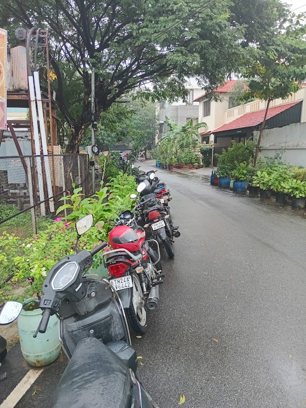
Like many, I’ve tried to de-stress by going for a walk, only to be forced off the sidewalk and into the street. Our sidewalks are often unusable—either encroached or poorly designed. The intersection of my experiences in testing, design and walking, made me view these sidewalks not just as civic problem, but as a design & behaviour problem. I began capturing pictures of various sidewalk patterns I encountered, trying to understand what makes some pathways easily walkable and others a nightmare. How might we reclaim these vital public spaces?
*Sidewalks are also known as footpaths, pavements, walkways, promenades, etc.
The Usability Flaws Forcing Pedestrians into the Road
In software, if a user interface is confusing or clunky, users simply abandon the app. On a city street, if a sidewalk is uneven, painful, or frustrating to navigate, pedestrians abandon it for the road.
Pedestrians naturally seek the path of least resistance—an even, continuous surface. Two major design flaws actively discourage people from using sidewalks:
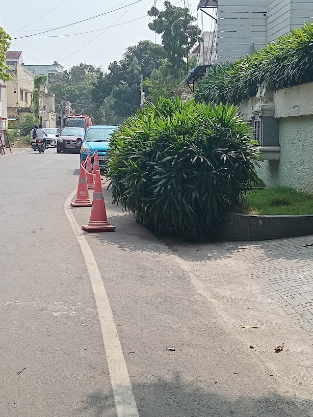
The Roller-Coaster Surface: Private homeowners and businesses frequently build steep driveway ramps or custom steps right through the sidewalks to transition into their properties. This forces walkers to constantly step up, down, and tilt sideways.
The High-Stepping Obstacle: Many sidewalks are built too high from the road level without a gradual transition. When a sidewalk abruptly forces a pedestrian to break their walking flow to climb a massive ledge, they choose to walk on the even road instead.
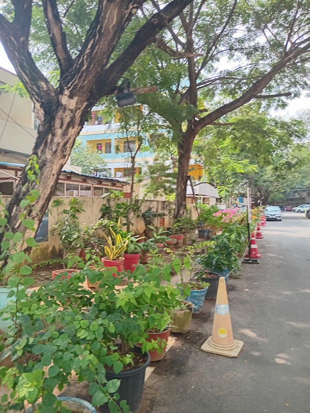
Below are some example of uneven sidewalks, which dissuade pedestrians from walking on them comfortably.
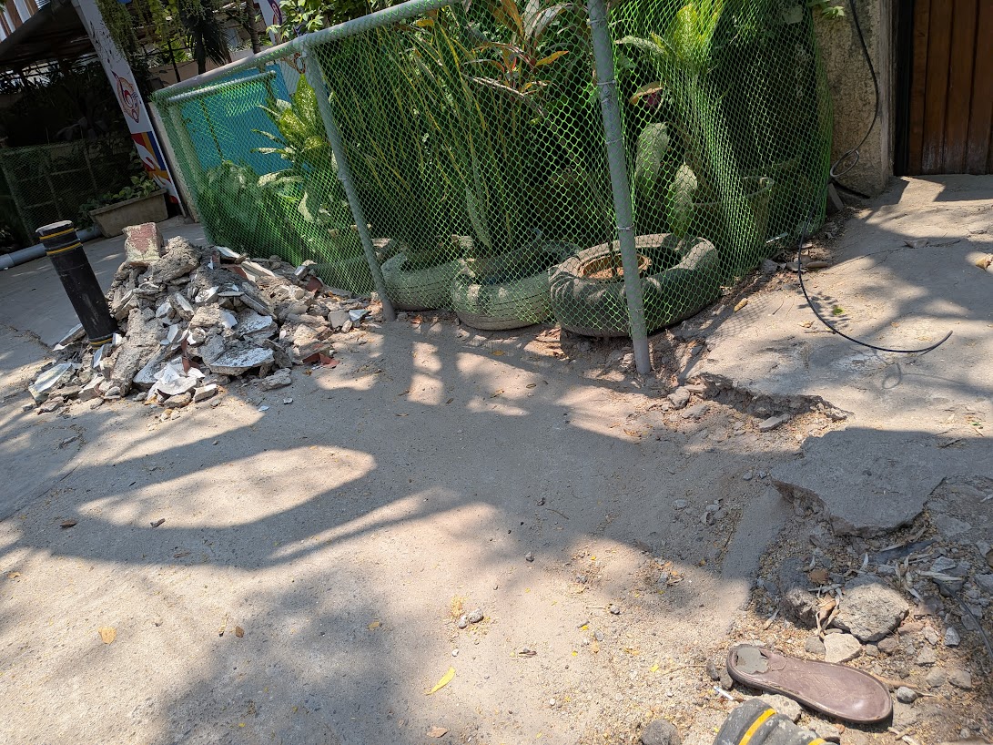
How do Sidewalks get Encroached?
Ramps & stairs extended beyond the home boundary, onto the public sidewalk
Shop advertisements placed onto the sidewalks
Shops extending their storage area onto the sidewalks
Shops converting sidewalks into customer parking
Small eateries placing tables onto the sidewalks
Food carts occupying the sidewalks
Ironing carts occupying the sidewalks
Tea shops extending the sunshades and letting customers utilise the sidewalks while refreshing
Housing building gates that opens outward rather than inwards or sliding sideward
Residents utilising the sidewalks for private gardens & security cabins
Unloading and storing construction materials (sand, bricks, cement & steel) onto the sidewalks rather than property premises.
Flex banners placed for marriage/birthday functions, political events and commercial advertisements
Municipalities and corporations using these places to erect light poles, transformers & overhead electricity/internet cables
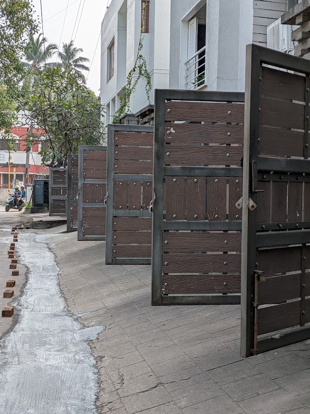
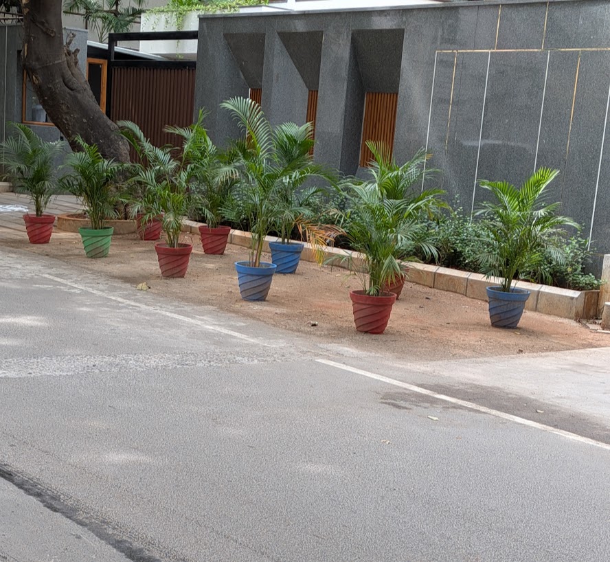
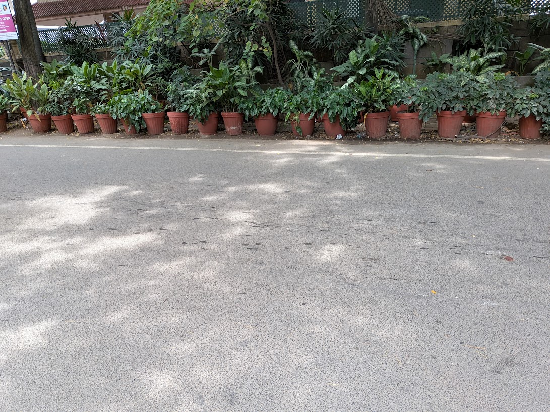
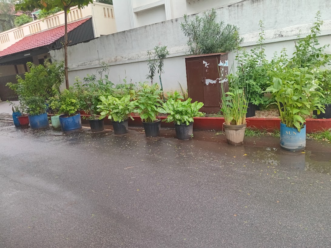
Encroaching to Prevent Encroachment
Below are a few examples of residents, shops & commercial establishments pre-emptively seizing public space to prevent others from doing the exact same thing. The rows of potted plants create a green, seemingly “innocent” barrier along the compound walls. However, it’s a passive-aggressive urban defense mechanism—using the social acceptability of nature to mask a visual land grab.
The underlying motivation is clear: “If I don’t occupy this space with something pleasant, someone else will occupy it with a vehicle or a stall.”
A Note on Design Philosophy: Design for the User, Not the Abuser
Ultimately, the biggest paradigm shift we need is in our core design philosophy. We must build our sidewalks—and all public infrastructure—with a user-first approach rather than an encroachment-prevention-first mindset.
Out of fear of street vendors and two-wheelers, municipal engineers today almost always take a defensive, containment approach. They build fortress-like, high-rise pavements or choke walkways with dense metal barricades. While this might occasionally deter an encroacher, it creates a hostile environment that entirely forgets the actual user—ultimately locking out senior citizens, children, and wheelchair users, and forcing pedestrians onto the dangerous main road. Defensive architecture that punishes the walker to deter the motorist is a fundamental failure of design. A sidewalk so deeply un-user-friendly is a failed product.
A true pedestrian-first approach accepts a simple truth: we must build for the ideal user experience first, and enforce rules against bad actors second. A user-centric sidewalk features a low-rise curb for easy access, smooth curb cuts at every intersection, and flat, continuous levels at property junctions.
Let’s build inviting, accessible walkways first. Once the usability is flawless, we can independently deploy targeted enforcement mechanisms—like structural bollards, automated surveillance cameras, tech-enabled policing, and spot fines—to keep bad actors out. We must stop punishing the pedestrian for the sins of the driver.
How might we design & build pedestrian friendly sidewalks?
How do we solve a problem that is deeply rooted in human behavior? Let’s look at behavioral economics.
The Nobel Prize-winning concept of Nudge Theory by Richard Thaler shows, how subtle cues can guide human behavior. If we put a sign to switch off lights before leaving the room, we are most likely to do so. What if we could apply this principle to our public spaces?
In his book The Tipping Point, Malcolm Gladwell argues that for an idea, trend or behaviour to spread, “The Power of Context” is crucial. Small, structural changes in our immediate environment can trigger massive, positive behavioral shifts in a community. The environment itself becomes the nudge.
What if we applied these principles to our sidewalks?
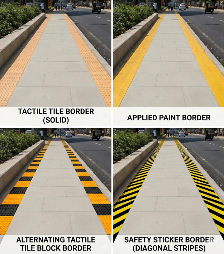
My idea is simple, yet I believe it holds the potential for significant impact: a new standard for sidewalk design based on these behavioral insights. What if we started using indicative colors on our sidewalks?
Imagine a universal standard where high-visibility, indicative colors are integrated directly into the edges of our sidewalks. These clear visual markers send a quiet, non-intrusive, but powerful message to street vendors, vehicle owners, and pedestrians alike: “This is the pedestrian zone. Respect it.”
We aren’t just painting lines; we are altering the context of the street. We are using the environment to nudge people not to encroach, not to drive vehicles on the sidewalks, not to extend their stairs, ramps and shops onto the sidewalks, and to gently guide pedestrians to walk on the designated path.
This behavioral design applies to structural elements too. Take private property gates, for instance. By standardizing gate hinges to be placed strictly on the interior of property pillars—or mandating sliding gates—we eliminate the physical hazard of gates swinging outward and blindly striking pedestrians on the sidewalk.
A small modification to our public space can potentially create a positive change in how we use it.
Illustration of a Better Sidewalk with Border Markings
*Images generated with the help of Gemini.
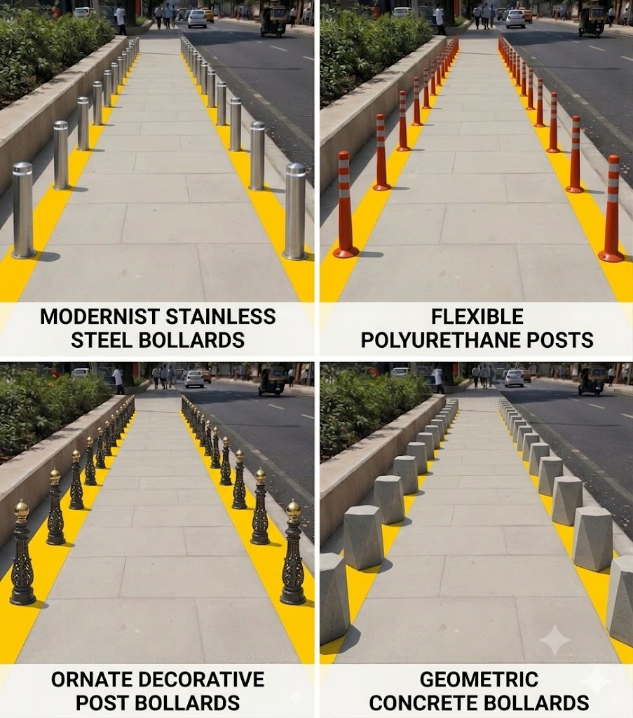
Illustration of Sidewalks with Bollards. Prevents Vehicles from Encroaching
What materials to use?
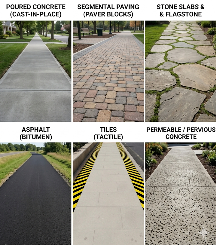
Below are a few examples of different materials with which a sidewalk could be built
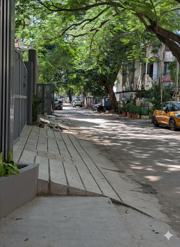
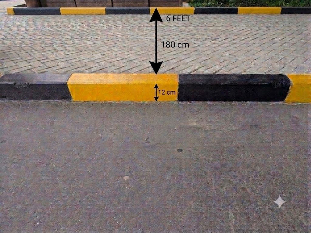
The above sidewalks are from my office complex. Found the height to be just ideal. Easy to step on. Measures 12cms in height. Third image is an AI generated depiction of sidewalk dimensions. 12cms of height. 6 feet of width that makes it easy for 2 people on wheelchair to move comfortably in either directions.
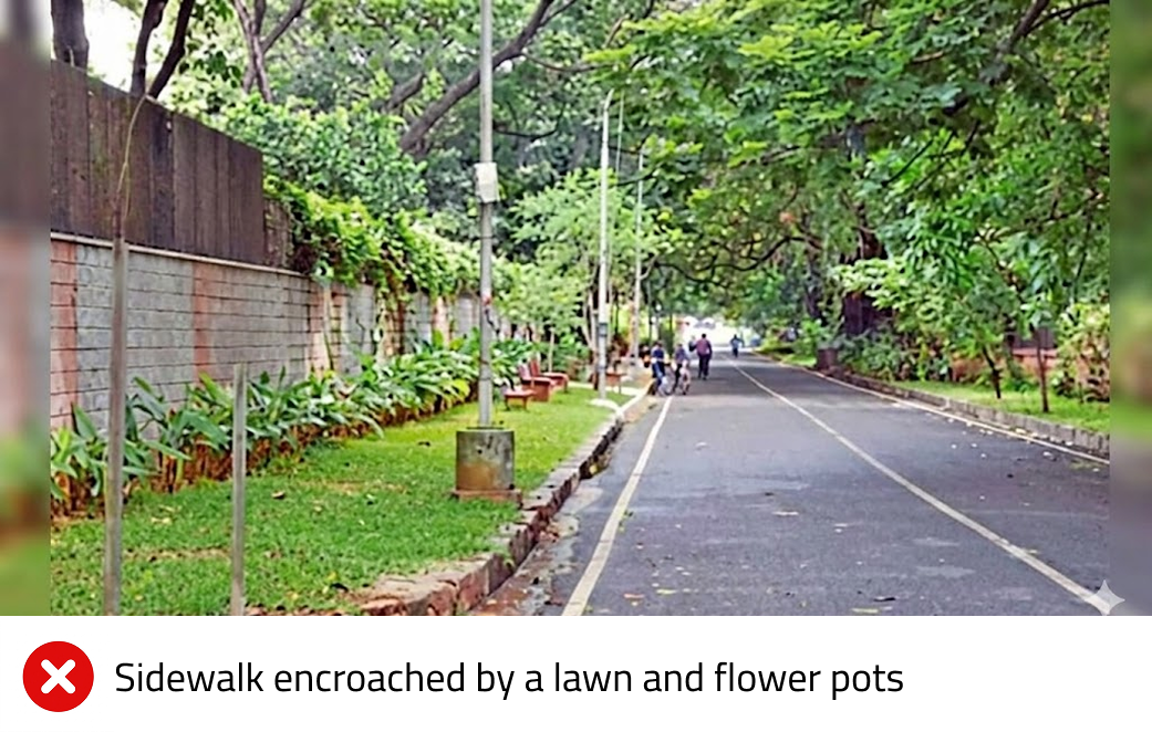
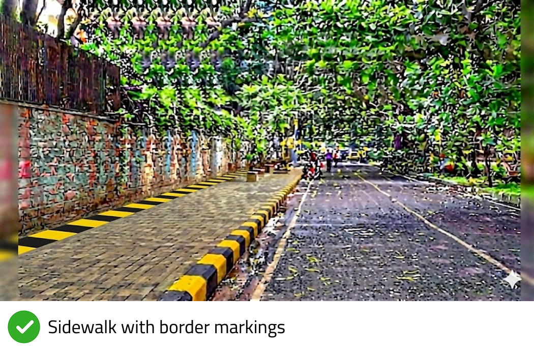
Encroachment by Private Gardens
Below images show a sidewalk encroached by a lawn and flower pots and an AI generated illustration of the same sidewalk with clear border markings, so as to dissuade people from encroaching a pedestrian space.
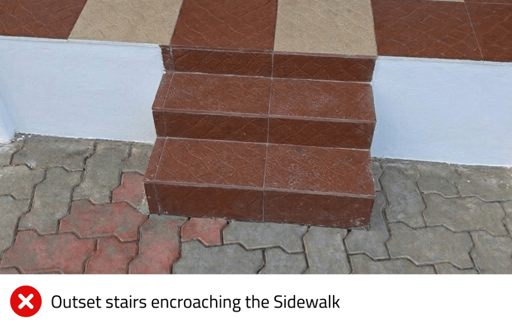
Encroachment by Ramps & Stairs
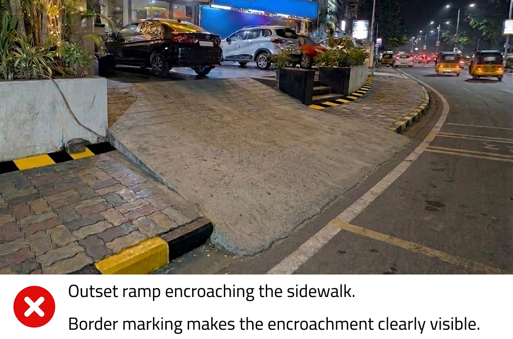
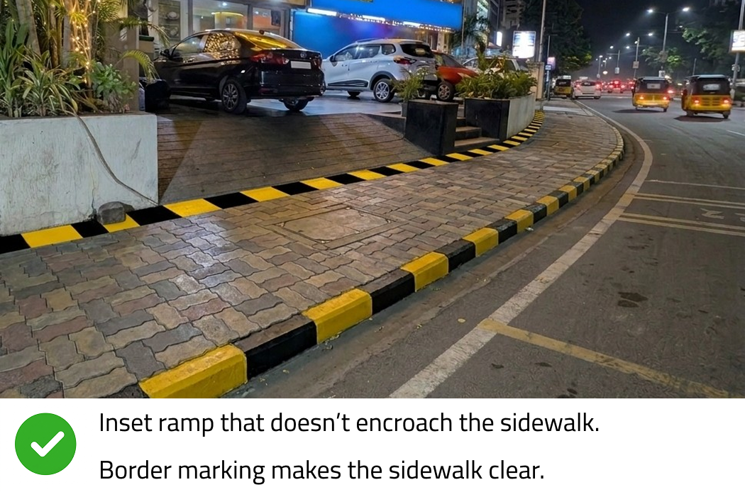
Houses, shops and commercial establishments frequently raise their structures well above street level to prevent rain water from coming in, or for better visibility. While these structural choices are understandable, they do not give owners the right to carve private stairs or ramps directly into public space.
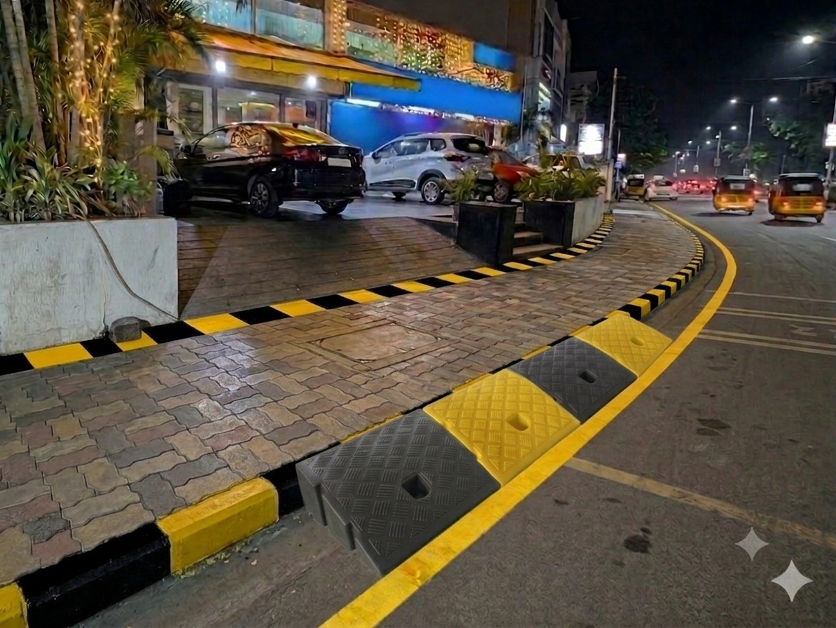
Instead, property owners should be educated and required to connect their buildings to the sidewalk using inset stairs or inset ramps built entirely within their own property lines. Any outset stairs or ramps that aggressively protrude into the public pavement/sidewalks must be legally classified as encroachments and penalized with appropriate fines. By pairing strict enforcement with high-visibility sidewalk border markings, we can create a powerful environmental nudge that prevents storefronts from spilling onto public pathways.
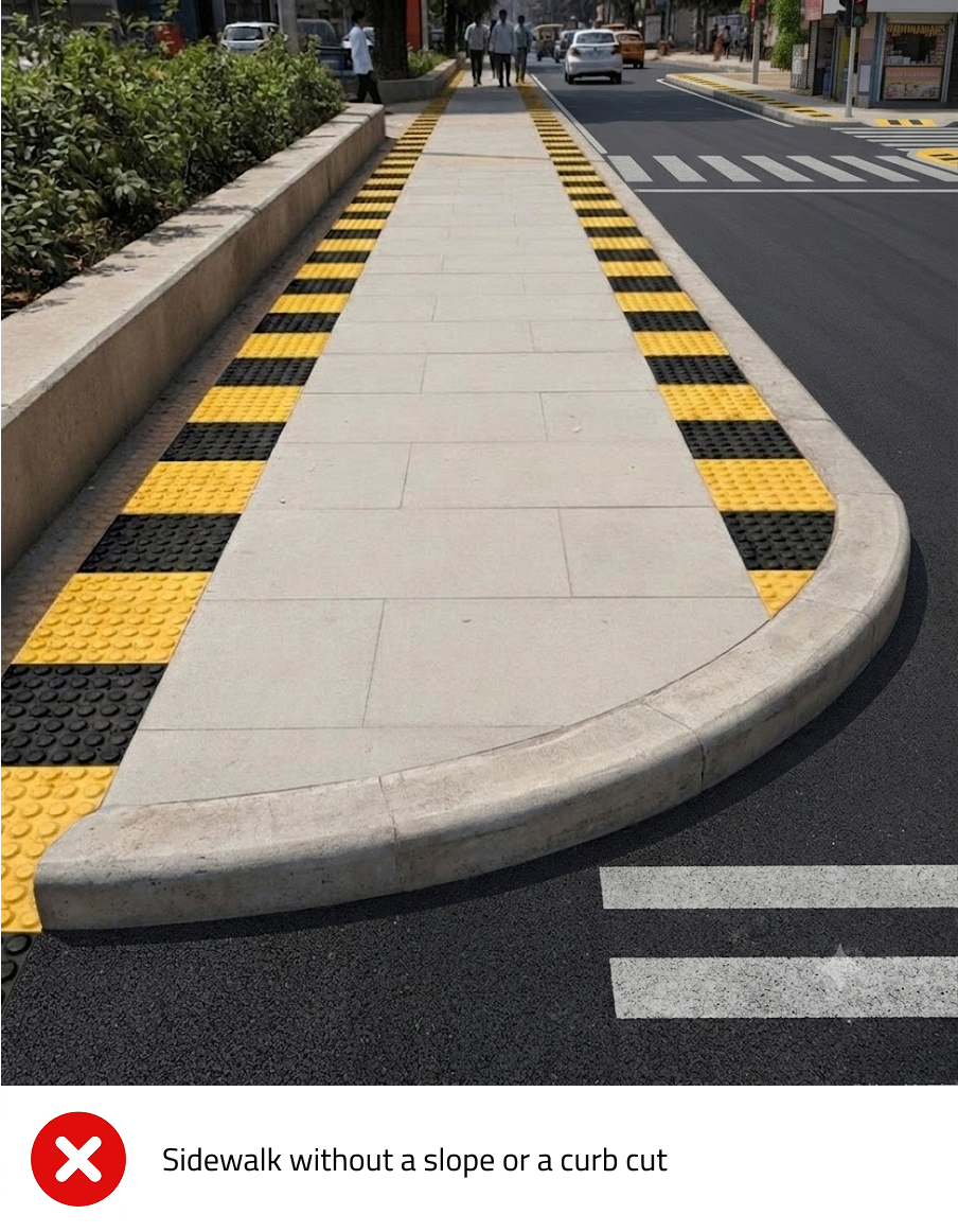
Sidewalks are infinitely easier to navigate when their entry and exit points are built as gradual ramps rather than abrupt vertical steps. In urban design, these are known as curb cuts—the small ramps graded down smoothly to meet the street level. This seemingly simple structural change makes traversing the city highly accessible for individuals with disabilities, but its benefits extend far wider.
In fact, the sweeping impact of this inclusive design is so profound that experts coined the term “The Curb Cut Effect.” The principle states that when you deliberately design for disabilities, you inherently make the experience better for everyone in the process. A curb cut built for a wheelchair user instantly becomes a massive convenience for a parent pushing a stroller, a senior citizen using a walker, or a traveler rolling a heavy suitcase.
To ensure these transitions are comfortable and safe, municipal bodies must adhere to standard ergonomic slope dimensions: 1:12 Slope
– Vertical Rise (Height): 12 cm – Required Horizontal Run (Length): 144 cms – Resulting Percentage Gradient: 8.33%
To maintain an entirely unobstructed walkway, we must be precise about how ramps are integrated into the streetscape:
From Property to Sidewalk (Inset Ramps): When connecting a raised home or commercial establishment to the sidewalk, the slope must be built as an inset ramp—carved inward into the property owner’s private plot line.
From Sidewalk to Road (Outset Ramps): Conversely, when connecting the sidewalk down to the road level at intersections or crosswalks, an outset ramp or standard curb cut should be used, grading gently downward to meet the asphalt.
By keeping private property access completely tucked away and public transitions smoothly integrated, the primary pedestrian zone remains entirely flat, free of physical obstructions, and safe from unexpected tripping hazards.
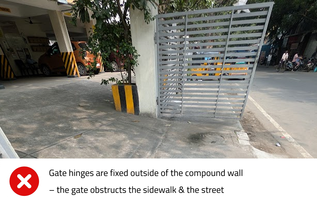
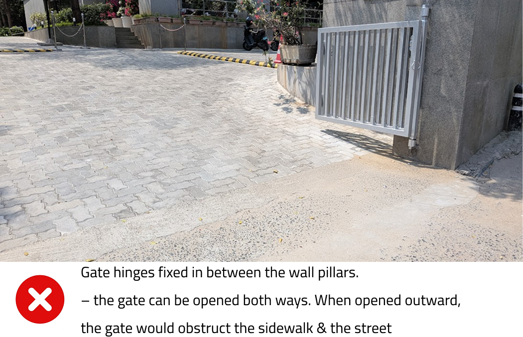
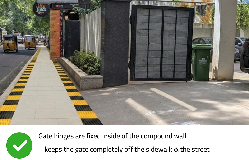
Gate Hinge Placements
Should compound gates swing inward, outward, or simply slide? While public, crowded venues like cinema halls are legally required by emergency egress and safety codes to have doors that push outward for rapid evacuation, private properties must follow a different logic to respect the streetscape.
To preserve a completely obstruction-free sidewalk, urban guidelines should mandate specific residential gate designs:
Interior Hinge Placement: Mounting gate hinges strictly on the inner face of the compound wall pillar naturally forces the gate to swing inward into the property, physically preventing it from swinging out and striking a passing pedestrian.
Sliding Gates: Alternatively, properties can install sliding gates that move laterally along the inside of the compound wall.
Both methods ensure that the gate consumes zero public square footage when opening, keeping the sidewalk entirely clear and safe for foot traffic.
Building Sidewalks that are Good Enough, Long Lasting & Easy to Maintain
Of course, a psychological nudge only works if the underlying infrastructure is robust. In a thriving, rapidly evolving urban landscape, sidewalks face a brutal reality: they are constantly being dug up. Between electricity boards, telecom providers, water lines, and sewage repairs, standard monolithic materials like poured concrete or asphalt are highly inefficient. Patching them up after excavation leads to uneven surfaces, waterlogging, and unsafe tripping hazards. To survive this reality, and build a sidewalk that lasts long, serves its purpose, and is easy to maintain, urban planners must move away from monolithic materials and design a modular, multi-utility infrastructure based on Indian Roads Congress (IRC:103) guidelines.
I. The Surface: Heavy-Duty Pre-Cast Interlocking Paver Blocks
For the walking zone, the absolute best choice is high-strength, pre-cast concrete interlocking paver blocks (minimum 60mm to 80mm thickness with an M-30 to M-40 strength grade) laid over a compacted sand bed.
Why it works for constant digging: Paver blocks are completely modular. When a utility agency needs to repair a pipe or lay a fiber-optic cable, worker crews can physically un-interlock the blocks by hand, dig the trench, complete the work, compact the sand base, and re-lock the exact same blocks back into place. The sidewalk remains flawlessly even. There is zero need for noisy jackhammering, expensive concrete transit mixers, or curing time.
Why it works for busy streets: High-grade concrete pavers can handle severe abrasion and the occasional illegal weight of mounting two-wheelers without cracking.
Best Practice: Choose a shot-blasted or textured finish to ensure it remains slip-resistant during intense monsoon downpours.
2. The Smart Design: The Dedicated “Utility Trench & Zoning” System
Material alone cannot solve the problem if utility lines are buried haphazardly directly under the walking path. Indian sidewalks must adopt a strict Zoning System in line with Indian Roads Congress (IRC:103) guidelines. Instead of burying cables in the dirt, the sidewalk structure should be engineered into three distinct functional zones:
The Multi-Utility Zone: Should the poles, bins, transfers be kept on the inner most edge of the sidewalk or the outermost edge? Keeping them on outer most edge acts as barriers or bollards preventing vehicles from encroaching. However, there are more chances of encroachment from shops and people are more likely feel claustrophobic to walk in between a shop or wall on one side and and a transformer on the other side. Practical experiences shows where a sidewalk has been placed behind a transformer or bus stop is only encroached or filled with filth. What if all the surface level utilities like streetlight poles, tree basins, garbage bins, transformers…etc. are placed in the inner most edge.
The Sub-Surface Utility Duct: Instead of burying telecom and power cables directly under the central walking path, a continuous pre-cast concrete underground trench (utility duct) with removable concrete covers should run directly beneath the Multi-Utility Zone (the innermost edge of the sidewalk). All wires are fed through this chamber. Workers can service cables simply by lifting a panel on the edge of the walk, leaving the primary path entirely untouched. Digging up the sidewalk is not necessary.
The Pedestrian Zone (1.8 to 2.5 Meters Wide): The sacred core of the sidewalk. It is kept completely clear of any poles, trees, or structural deviations, allowing two people (or two wheelchairs) to pass each other comfortably.
3. Perimeter Defenses & Universal Access
To prevent sidewalks from becoming informal parking lots or extensions of storefronts, specific design features must be cast into the hardscape:
Optimal Kerb Height (150 mm): Per IRC standards, the kerb height must be kept exactly at 150 mm (6 inches) above the road level. Anything higher discourages senior citizens and pedestrians from scaling it (forcing them to walk on the dangerous road), while anything lower allows cars and auto-rickshaws to drive onto it easily.
Anti-Parking Bollards: Heavy-duty concrete or cast-iron bollards must be permanently anchored at all property entrances, ramps, and intersections with a clear gap of 1.2 meters between them. This gap is wide enough to let wheelchairs and strollers pass seamlessly but physically blocks two-wheelers and cars from driving up onto the pavement.
Continuous Level Property Ramps: Commercial street entrances often break sidewalks into a roller-coaster of mini-ramps for private parking access. The sidewalk must maintain a flat, uninterrupted elevation. If a vehicle needs to cross the sidewalk to enter a building, the road should ramp up to the sidewalk level at the edge, forcing the vehicle to slow down and preserving a continuous surface for the pedestrian.
4. The On-Street Parking Buffer—and Curbing Commercial Abuse
We have to acknowledge why two-wheelers mount the sidewalk in the first place: shoppers have nowhere else to put them, and our roads are intensely congested. If we don’t design a dedicated space for stationary vehicles, they will inevitably colonize the pedestrian zone.
To solve this, urban planners should explicitly paint and mark the outermost lane of the asphalt road as a dedicated parking lane. By shifting parked vehicles off the curb and onto a designated strip of the road itself, we create a natural, heavy physical buffer between moving traffic and the sidewalk.
However, in any system design, we must anticipate and prevent bad actors from exploiting public convenience. In a typical Indian urban ecosystem, ad-hoc public parking spaces are frequently hijacked by predatory commercial entities:
The Showroom Overflow: Automobile showrooms and two-wheeler service centers routinely use public sidewalks and roads as their extended inventory lots, parking dozens of customer vehicles outside and entirely choking the street for genuine neighborhood visitors.
The Valet Encroachment: Restaurants and luxury establishments launch valet services, effectively hijacking entire public residential streets for private parking. While neighborhood residents are completely understanding of a guest parking in front of a home for a short duration, the permanent commercial annexation of common public roads by restaurants is unethical and disruptive.
Therefore, designated street parking must strictly remain a public utility—never a free operational loophole for private businesses.
Summary of the Sidewalk Architecture:
Surface Material: Modular, high-strength pre-cast concrete interlocking paver blocks over a compacted sand base.
Sub-surface Architecture: Pre-cast concrete utility ducts situated under the inner edge to prevent road cutting.
Boundary Protection: 150mm high granite kerb stones paired with 1.2m spaced structural bollards at access points to negate vehicular encroachment.
This systemic approach turns a simple walkway into a resilient piece of urban infrastructure that accommodates the inevitable chaotic maintenance demands of a thriving city.
Moving from Concept to Reality: The Lean MVP Strategy
Reading essays by Paul Graham, I understand that it is nearly impossible to predict the absolute success of an idea upfront. The most effective approach is to launch a Minimum Viable Product (Do Things That Don’t Scale,) let the real users use it, observe their interactions, gather feedback and keep iterating to achieve the perfect fit.
As a resident of Tamil Nadu, I would like to humbly share a few suggestions with our state government and municipal corporations. Before committing public funds to mass-scale infrastructure, the government and its municipal corporations shall treat sidewalk design as a live, behavioral experiment. We cannot write the rulebook until we test it in the wild.
Phase 1: The University Prototyping Grounds
The government can partner with the civil engineering, architecture and design departments of elite institutions such as Anna University, IIT Madras, NIT Trichy or the National Institute of Design, and fund experimental 500-meter sidewalk loops of various designs, both inside their campuses and on adjacent public roads.
These institutes can independently design, build, and test various combinations of real-world features:
Materials: Comparing modular paver blocks, poured cement, and natural stone.
Dimensions: Testing heights (road-level, 12 cm, and 1 foot) alongside widths (6 feet for residential areas, 8 to 12 feet for busy commercial zones).
Visual Prompts: Testing different edge markings like high-visibility paint, colored tiles, and embedded textures.
Edge-Case Engineering: Developing adaptive blueprints for complex urban realities. For example:
Around Mature Trees: Designing floating wooden boardwalks or porous rubber-concrete rings around tree basins. This preserves the historical green canopy while preventing thick tree roots from bursting through and fracturing the flat pedestrian surface.
Over Open or Covered Storm-Water Drains: Designing modular, heavy-duty pre-cast concrete structural slabs that double as both the drain lid and the primary sidewalk foundation, fitted with easily liftable silt-trap panels for rapid flood-monsoon maintenance.
Around Bus Transit Shelters (The Split-Stream Design): Traditional bus shelters are often dropped directly into the center of footpaths, creating massive bottlenecks and forcing walkers onto the asphalt. The university prototype should design a “Split-Stream” layout:
The Waiting Zone: The physical bus shelter, seating, and passenger waiting area must be pushed to the outermost edge (nearest to the road), integrating seamlessly with the on-street parking or boarding buffer.
The Unobstructed Walking Zone: The sacred, flat pedestrian path must channel cleanly behind the bus shelter structure. By keeping the walking stream completely separated from the stationary waiting stream, we eliminate commuter foot-traffic friction, ensure continuous accessibility, and eliminate the dead, dark corners behind transit shelters that typically accumulate filth.
By tracking student and public pedestrian usage data, mapping material erosion, and noting which designs naturally nudge pedestrians to use sidewalks, deter encroachers, and can last long enough, these research teams can discover which design of the sidewalk actually works.
Phase 2: The Bill of Materials (BOM) Template
Crucially, this university-led MVP will produce a highly practical, open-source engineering blueprint for public works departments. Rather than vague guidelines, the template will provide precise, granular material breakdowns.
Standardized Estimation Example (Per 100 Meters of a 6-Foot Sidewalk):
Excavation & Base: Exact depth of earth to be dug and volume of gravel/sand base required.
Materials: Exact metric tonnage of cement, sand, and high-strength pavers needed.
Perimeter Guard: Exact square footage of high-visibility edge paint or colored tiles.
Bollards: Exact count, optimal material (steel vs. reinforced concrete), and exact weight specifications per unit.
By compiling these granular, standardized metrics, municipal agencies can instantly calculate the precise cost of laying every 100 meters of sidewalk, eliminating bureaucratic guesswork and streamlining transparent public tendering.
Phase 3: The Lighthouse Road Strategy (One Major Road Per Year)
Once the university prototype yields a standardized blueprint, the municipal corporation should resist the temptation to execute a rushed, city-wide rollout. Instead, the strategy must scale gradually by transforming one flagship corridor into a “Lighthouse Road” every year.
In Chennai, the city could target a definitive stretch of Anna Salai; in Bengaluru, it could be a pristine section of MG Road. The mandate for this chosen corridor would be uncompromising: redevelop it entirely to global standards. It must feature flawlessly level modular pavers, integrated sub-surface utility ducts, high-visibility pedestrian border markings, and legally designated on-street parking lanes.
Just as ward councillors can commit to delivering one neighborhood Walking Quadrangle per quarter (as detailed in the upcoming ‘Walking Quadrangle’ section), city corporations must commit to delivering one world-class Lighthouse Road per year. Experiencing a perfectly executed, continuous walkway in the heart of the city changes public expectations overnight. It gives citizens a tangible benchmark of what their streets should look like, building the immense civic and political will required to systematically upgrade the rest of the urban landscape.
Therblig & Codification: Why the regulators should create and publish definitive standards?
Once the university prototyping phase delivers data-backed clarity on the optimal design, the regulators must codify these findings into a clear, open-source public manual. When the government and affiliated regulators create and publish standards to build sidewalks, it removes the confusion and different ways in which these sidewalks are built.
In the study of ergonomics and motion economy, Therbligsrepresent the fundamental, elemental motions required for a human to complete a task. In software, we eliminate unnecessary clicks to optimize a user’s flow; in urban design, regulators must use the verified prototype data to eliminate unnecessary physical friction—or “negative Therbligs” like tripping hazards, unexpected slopes, and sudden drop-offs—for the everyday walker.
Publishing these clear standards does something magical: it channels private, organic capital into uniform public infrastructure. Walk down any commercial street and you will see business owners who willingly spend their own money to pave the mud patch in front of their properties—some out of pure civic altruism, others to give their storefront a premium look.
Because there is currently no official playbook, everyone—including different government agencies and private property owners—builds in their own haphazard way, creating a chaotic patchwork of varying tile textures, mismatched heights, and uneven steps.
WITHOUT STANDARDS (Chaotic Patchwork): [Shop A: 1-foot high granite] -> [Shop B: Mud patch] -> [Shop C: 6-inch concrete ramp]
WITH STANDARDS (Seamless Flow Based on MVP): [Shop A: 150mm Pavers] ———> [Shop B: 150mm Pavers] -> [Shop C: 150mm Pavers]
By providing a clear, open-source blueprint born from the university experiments, the government can effortlessly standardize the streetscape by leveraging the self-funded pride of local property owners. When Shop A paves their front today, and neighboring Shop B does the same next month, their footpaths will seamlessly merge at a fixed height and width.
To guarantee this frictionless flow, the final published standard manual must mandate precise rules for common structural intersections:
The Inset Rule for Buildings: Any curb or driveway ramp connecting a private building to the sidewalk must be designed as an inset ramp (carved inward into the property line), keeping the walking path entirely flat.
The Outset Rule for Roads: Any pedestrian ramp connecting the sidewalk down to the road level must be designed as an outset ramp or a standard curb cut, ensuring a smooth transition into crosswalks.
By formalizing these layouts based on proven prototype data, we remove all confusion, keep the sidewalk perfectly even and clear, and make movement easier for pedestrians, without the risk of tripping due to the obstacle created by the curb ramps.
Addendum 🙂
The Walking Quadrangle
Not everyone in our cities lives near a public park or playground, which are disproportionately concentrated in more affluent localities. To democratize access to public health, how about we design a localized “Walking Quadrangle”?
A daily routine of 10 brisk walking rounds (approximately 5.6 km) is a highly effective, low-impact exercise. Consistently repeated five days a week, this simple protocol drastically improves cardiovascular health, manages blood pressure, and boosts endurance. We need to make walking a visible civic priority.
Consider this practical blueprint for our local governance: If a single ward councillor commits to upgrading just one continuous Proximity Walking Quadrangle per quarter, the long-term impact is staggering. By the end of a single five-year term, that councillor will have delivered twenty fully cleared, continuous, and cleanly paved walking loops. This completely transforms the micro-mobility and physical health of an entire ward without breaking the municipal budget all at once. Best of all, it gives local representatives a highly visible, trackable achievement to showcase to voters every three months.
The Residential Wellness Circuit
This philosophy of prioritizing daily utility over marketing fluff is a framework that private real estate desperately needs to adopt. In many Indian gated communities, premium amenities like swimming pools have turned into mere marketing tools; studies show a vast majority of homeowners rarely use them, yet societies pour massive maintenance funds into keeping them functional. Instead of chasing a superficial “100+ amenities” checklist that only looks good on a sales brochure, forward-thinking builders should channel those resources into a beautifully paved, 6-foot-wide, entirely unobstructed walking track along the inner perimeter of the housing society. This track should be lined with hardy, shade-bearing trees that can survive long-term with basic watering, replacing high-maintenance, namesake gardens. Designing for actual human habits rather than namesake luxury transforms a residential complex into a functional wellness asset.
Can a vehicle like this dissuade encroachment?
Below is a depiction of an encroachment clearance vehicle that is mounted with a camera to capture on spot evidence, generate fine and immediately remove sidewalk encroachments like shop name boards placed onto the sidewalks. The government can work with organisations like eGov foundation to create a software product that can capture evidence of encroachment using the camera (like how Google does for streetview,) add time, date and location details, generate immediate fine slips, collect payments or mark pending payments for spot fine and track repeat offenders…etc. The fine slip should have a QR code which will redirect the offenders to a page detailing the sidewalk standards or guidelines and how to build or maintain an ideal sidewalk, free of any kinds of encroachments. The software should also have options to accept evidence of encroachment from the public. Ex. the public, when they see and encroachment, should be able to capture an image on their phone and easily share it to a designated number maintained by the corporation, just through an RCS-SMS or WhatsApp message, along with details like the location, date and time.
Sample image of an Encroachment Clearance Vehicle, generated using Gemini.
Can a sticker dissuade street parking?
This might sound slightly harsh. Still expressing my thoughts. A spillover effect of corruption in real estate and the inflated real estate prices is home owners building house without parking space. An extra room brings them extra rent to justify the inflated price of purchase. This leads to street/roads being constantly encroached with cars parked in the night. What if municipal authorities take up night patrol and put an yellow sticker on the front windshield of the streetside parked cars, with a QR code that advises the car owners to pay some monthly parking charges? The software mentioned in the previous paragraph, to track encroachment can be used to track these too. Any streetside parked car that hasn’t paid up should be randomly towed. This can gradually make people park cars within their house premises in the night, rather than on roads.
Civic Social Nudge
Despite robust physical infrastructure, there will always be a fraction of reckless motorists who choose to ride on sidewalks, actively endangering pedestrians. To counter this, municipal corporations can deploy targeted digital accountability campaigns backed by automated enforcement. By identifying high-violation hotspots and installing dedicated surveillance cameras, the city can seamlessly cross-reference captured license plates with the central Vahan portal. Crucially, the evidence from these cameras can be used to instantly fetch vehicle data and issue automatic fine slips (e-challans) directly to the violators. To amplify this deterrent, the city can also clip and publish these traffic violations on official social media handles—or as civic awareness reels before movie screenings in local cinema halls—overlaying the owner’s masked name, violation date, and exact location directly onto the video. Combining automatic financial penalties with visible public accountability introduces a powerful psychological deterrent, leveraging both the law and social pressure to reclaim the sanctity of our walking spaces.
The Socio-Political Friction Points
Beyond structural engineering, reclaiming our sidewalks requires navigating deeply entrenched socio-political habits. Two massive challenges stand out:
1. The Flex Banner Hegemony How might we tackle the endless rows of political advertisements, commercial notices, and birthday or marriage wishes printed on PVC flex banners that routinely hijack our walkways? While a blanket government ban on flex banners is an obvious legislative step, true change requires a cultural shift. Can political and social organizations take a collective self-pledge to banish public road displays during rallies and events? Moving these announcements to digital spaces preserves the sidewalk for its intended user: the citizen.
2. The Legacy of the “Mud-Patch” Habit To understand our current sidewalk crisis, we must look at how our roads evolved. Decades ago, when the government built the first single or double-lane roads, a vast, unpaved mud patch was left on either side of the asphalt. Landowners naturally built their commercial establishments right up to their property lines, and their customers used that vacant public mud patch as a convenient parking lot.
Today, as traffic has exploded and those roads have expanded into dense four-lane or six-lane corridors, that public mud patch has been converted into the modern asphalt road and pedestrian sidewalk. Yet, the old habit remains. Commercial establishments still expect the immediate public road and pavement to serve as their private, ad-hoc parking zone, paralyzing micro-mobility.
How might we nudge commercial establishments to design their buildings so they stop encroaching on public paths?
The Setback Incentive: Municipalities can introduce architectural zoning rules that offer property tax rebates or minor floor-area incentives to commercial buildings that voluntarily build a set-back “parking pocket” inside their property lines.
Physical and Legal Nudges: We must use uncompromising street infrastructure—like high-quality bollards and automated towing zones—to signal that the road and sidewalk are strictly transit corridors, forcing developers to solve their customers’ parking needs internally through smart design.
3. Integrating Local Livelihoods How might we address informal street micro-economies, like the traditional ironing carts (istri boxes) that occupy sidewalk spaces. Instead of aggressively displacing these workers and harming their livelihoods, we can use an institutional nudge. Municipalities can incentivize Resident Welfare Associations (RWAs) to integrate a dedicated, micro-paved kiosk for an ironing vendor within their apartment or colony compound lines. By moving the service just a few feet inward, we completely clear the public pavement while ensuring the neighborhood retains its vital daily services.
The Impact 🙂
Many of us have dreamt of living in a place like Singapore just to experience the sheer ease of its clean, predictable, and beautiful streetscapes. But we don’t need to emigrate to experience that reality; we can build it right here.
Designing sidewalks with a pedestrian-first mindset does something far deeper than just paving a path—it directly unlocks our public health and mental peace of mind:
Activating a Natural “Blue Zone” for Health: One of the defining characteristics of global “Blue Zones”—regions where people consistently live healthy lives past the age of 100—is built-in natural movement. Longevity is cultivated when an environment naturally invites you to move. When a city provides safe, continuous, and shaded sidewalks, walking a kilometer to the local market, school, or office stops being a hazardous chore and becomes a default, healthy habit that adds years to our lives.
Restoring Peace of Mind through the Last Mile: The primary reason citizens abandon public transport isn’t the train or bus ride itself—it is the exhausting mental friction of the “last mile.” If the walk from home to the metro station is a chaotic obstacle course of broken pavers, open drains, and speeding bikes, our daily peace of mind is shattered. Flawless, walkable sidewalks seamlessly bridge this gap, restoring calm to our daily commutes and unlocking the true potential of public transit.
Defining clear standards, enforcing strict structural uniformity, and using environmental nudges to prevent encroachment ultimately transforms the cultural and behavioral fabric of our public spaces.
When our walkways become seamless and unobstructed, our streets will naturally mirror the dignified, world-class landscapes of developed nations. Reclaiming the sidewalk isn’t just a minor civic upgrade; it is how we elevate Indian cities to command global respect and offer our citizens the standard of living they truly deserve.
Thank you for reading 🙂 What is the biggest obstacle or design flaw that prevents you from using the sidewalks in your neighborhood? What structural or visual changes would make them truly user-friendly for you? Please share your experiences and thoughts in the comments section below.
During the 2010 rainy season, a 3 feet portion of my house compound wall broke. (The wall was built using stone blocks, red sand and plastered on top with cement, in 1970 period i.e. approx. 40 years back, by my grandfather.) We hired a local mason and requested to rebuild the damaged portion, in the same way, reusing the stone blocks so that it looks even with the rest of the wall. The mason, along with a helper, took 4 days to place the uneven stone blocks, fill the gaps in between carefully, with smaller sized stones and plaster it. In another 2 years, an even larger portion of the compound wall too fell during the rainy season. The wall was about 40 ft in length. Once again, called the same mason and requested him to rebuild the damaged wall using the fallen down stone blocks. He said, it would take weeks to rebuild with same stone blocks and labourers with him are all aged people who cannot carry such blocks. He said, demolishing the entire wall quickly using a JCB and rebuilding using hallow block bricks would only take 2-3 days, cost much less and look even across. We agreed and rebuilt the entire eastern side of our house compound wall using hallow block bricks.
The Broken WallThe DebrisThe Rebuilt Wall
12 years later, i.e. in 2022-2023, I glanced on an article through Medium or Linkedin, explaining modern scientific management and referring to Frank Bunker Gilbreth’s Bricklaying Ergonomics. I was quickly able recollect what our mason said while we were rebuilding the damaged wall and corelate this with how evenly sized and lesser weight hallow block bricks helped build the wall quicker, without compromising the purpose of the compound wall.
A few months later in 2023, when I had to shift my house, one of the many aspects, I had to decide the house, was based on the furniture we had with us and one of the decision point was the size of bedroom, kitchen & living room. Every house we saw had different room dimensions, making it difficult to make a decision faster. Post shifting to the new house, we had another difficulty. The window curtains and velcro based mosquito nets we had used in the previous house was not fitting here. I was then recollecting Gilbreth’s Bricklaying Ergonomicsand a thought striked!
How Might We Create Standards in Home Construction?
What if real estate builders and regulators like RERA came up with standard room dimensions? Something similar to T-shirt sizes. For example,
S-Small (Kids Bedroom) – 10’ x 10’
M-Medium/Regular – 12’ x 14’
L-Large (Master Bedroom) – 14’ x 16’
Wardrobes could be mass produced, keeping in mind the room dimensions, which in turn could be cost effective and easy for the buyer to decide, while buying a house.
What if builders and carpenters came up with standard door dimensions? Doors with defined standard dimensions can be mass produced and hence will be cost effective. When a need arises to replace, we can just tell the door size and buy one, which can also be fixed much quicker than custom made ones. For example,
S-Small (Bathroom door)
M-Medium/Regular (Bedroom door)
L-Large (Main entrance door)
What if builders and carpenters came up with standard window dimensions? Same like doors, windows with defined standard dimensions could be mass produced.
There can be various combinations of room dimensions, based on where the room door faces, where the windows are, where the wardrobes are and to which side the bathroom is built. However, based on experience a standard room will fit a wardrobe for 2 people, a king sized bed with space for side tables on either side, some space for a study table and some space to walk around.
The size of bedroom and kitchen could be standardised and the size of living room could be adjusted as per the left over available space.
If I were to build an apartment complex for the middle class, how would I design?
I ll build a 3 bedroom+study+kitchen+living room(hall)+utility+foyer. Why___
Walking track___
Social balcony at each floor___
Having a study room, with a proper study table and chair lets us focus, concentrate and ultimately improves learner outcome. What if every house is built with a study room?
Having guests at home and socialising, improves ones happiness. What if every house has a guest room?
If I were to build a studio apartments for the lower income people, how would I design?
Foyer___
Utility___
Study___
I would use simple and easy to maintain objects.
Stairs – ideal width & inclination?
*Will update my thoughts
I have observed that, in villages, lands are sold with price per acre, whereas in cities lands are sold with price per sqft or price per ground (40ft*60ft=2400sqft.) What if all housing plots formed as 40*60ft sizes so that it is even and construction can be planned accordingly.
“The most important, and indeed the truly unique, contribution of management in the 20th century was the fifty-fold increase in the productivity of the manual worker in manufacturing.”—Peter Drucker
PS: Another example I could think of is my Diwali dress stitching. When I was young, it was a tradition to buy / stitch a new dress. Like us almost a maximum percentage of people stitched new dresses during Diwali. we had to buy the cloth a month in advance, visit the tailor shop, take measurements and then wait for weeks to get the newly stitched dress, to be worn on Diwali. Fast forwarding, I have never stitched a dress for more than a decade and buy readymade ones, which comes marked with sizes like S, M, L, XL, XXL…etc for T-shirts and shirt sizes like 36, 38, 40…etc, specific to India. I visited a garment factory in Tirupur, from where lots of garments are bulk manufactured and exported to many countries and saw how cloths in hundreds are laser cut and sent to tailoring sections, which speeds up the mass production process.
Today’s newspaper carried a full page advertisement on The Gen AI Hackathon. Also, glanced similar ads on X a few days back. The deadline is today. The problem statements are interesting to solve. Due to personal obligations, and time constraints I wasn’t able to plan and prepare detailed solutions. On this Gandhi Jayanthi holiday, spent time on this simple chatbot solution: Asa.
Done is better than Perfect. Publishing a solution to the below problem statement.
“Indian is the 7th largest country. Can you make it #1 for flight experience.”
I expanded on my earlier idea on Air Safety Awareness, by picking one use case with two personas:
Subbu & Eswari are retired couples visiting their son in New York, US. Their ticket from Chennai to New York via connecting flight at London, has been booked in advance by their son . How might the airlines guide them to fly at ease.
Recommending them to install an app might not work out as many travellers don’t want to install one more app. How might we utilize WhatsApp or RCS messages to help them fly at ease.
Since the problem statement was shared by Akasa, came up with the chatbot Asa. (name suggested by Gemini) Since the Akasa logo is called the “Rising A,” contemplated on some names like “The Guiding A,” “Fly at Ease,” “A-hostess” but settled with Asa, because when the chatbot interacts with the passengers on WhatsApp, “Hi, I’m Asa…” sounds easy. Referred to branding guidelines from AkasaAir: Sunrise Orange: FF6300 & Passionate Purple: 5C0FD9. Gemini suggested that the font used in the logo might be a custom one. “AS Circular” or custom “Poppins.”
*n.b: Referring to the name Akasa and its branding guidelines, as the problem statement I picked has been shared by Akasa. No intention to infringe on Akasa’s brand identity in any way.
Let’s delve into Asa‘s role:
The airline collects the mobile no. of passengers, while booking the ticket.
Asa sends the first Hello to Subbu & Eswari, immediately after the ticket is booked.
Asa migh have created a WhatsApp group between Subbu & Eswari and started the conversation. However, many people have the tendency to use the groups to forward casual messages, videos and photos and the actual guiding conversation from Asa might get lost in between other unimportant forwards. So, Asa will stick to messaging individuals 🙂
Asa sends a reminder 2 weeks before the flight.
Asa sends a reminder 1 day before the flight.
Asa sends guiding instructions on the day of departure.
*Chat window, designed using Figma
The users updates a list of items or photo of items in the bag and checks if anything is prohibited.
The user shares the dimension of the carry on luggage and checks if it will fit in the storage cabin.
Asa lets users to enter the language of choice and send voice based responses.
Why this matters to the airlines? An exceptional customer experience goes beyond service – it’s about trust, communication, and support at every step of the flyer journey. Being supportive and providing easy access to information can transform the flyer experience, build trust, increase loyalty, besides saving hours of wasted time.
Please click & expand for a wealth of resources & references
I was reading the below news and was able to correlate to the check-in experiences my colleagues had shared. A few were first time travellers and a few seasoned travellers. Summarised the problems with a few personas below:
Meenu, an IT executive, who took her first international trip a few years back said, she was very anxious while preparing for her trip. She had reached out to her friend Kiru, who had experience of travelling to a few countries. Meenu had saved the below instructions shared on WhatsApp, by her friend:
********************
*Check-in*
Get into airport, find your airlines counter from signboard.
Get in to the respective queue (Business/Economy & Web check-in/Counter check-in.)
Drop the check-in bag. It will be weighed. Should be under weight of the limit. Collect your boarding pass. Make sure you collect back your passport after verification.
Collect the Immigration form. It will be distributed by your airline staff in front of the counter (mostly when you are entering in the counter or you might need to collect it in front of the immigration location.)
You will be pointed to the immigration area.
*Immigration*
Fill the immigration form. Its good to have a pen always with you.
Get into the immigration queue. One at a time in the immigration counter even if you are going as a family except kids who can join mom/dad.
You will be interviewed and photographed and will be the exit approval from India.
Note: Have your travel documents in a file or folder handy as you need to produce respective ones as they ask for verification. Sometimes your office ID card too.
Collect your passport & boarding pass back.
You will be pointed to security check counter.
*Security check*
Separate counters for each gender.
Get into appropriate counter. Take out the items to be scanned individually- laptop, tablet, phone, jacket, belt, watch, shoes & toiletry (depends on the airport). Basically no steel. Empty your pockets. You will be provided with trays to place these items. Place these trays and your bags on the running belt to scan and give your passport & boarding pass to the staff at this place.
Note: Your carry-on bags should not have any pointed materials like knife, scissor so on. No lighters. No water. No liquids more than 150ml of each.
Get into the scanner.
If you are beeped, then you will be inspected separately again.
Else, collect all you stuff. Re-pack and wear back your shoes and you are free now to find your gate.
*Getting to Gate*
Check your boarding pass to see gate number.
Watch out for sign board and walk to your respective gate.
Note: When you are in transit and taking connecting flight, periodically check the flight information board to confirm there is no flight time or gate change.
Once you reach your gate, confirm once with the screen over there that your destination and flight number is correct and you are at the right place to board.
Be here, max by 45 mins early to your flight timing. Eg: Flight time: 8.45AM, Boarding time: 8.15AM, You should be at gate: 8.00AM.
*Shopping*
If you have enough time for boarding, you can roam around or chill out or do some shopping.
If done, get back to your gate and rest until your boarding starts.
*Boarding*
Get into the boarding queue as per instructions provided by the airline staff over there.
Your boarding pass will be scanned and torn apart. You will carry your part of it.
Walk into the flight belt. Keep your pass in hand as there will be staffs to assist you and they will ask for it.
Note your seat number from the pass.
Step into the aircraft. Air hostess will greet you, acknowledge and get in. Sometimes they will ask your seat number to route you to the right pathway.
Find your seat and get settled. Drop your bag in the cabin.
Take things which you wanted with you like tablet, book to read or MP3 player or neck pillow…etc.
Put your gadgets in airplane mode or switch it off.
Now, you are set to fly.
********************
Leka, a leisure traveller who had flown abroad a few times, said she once took a Swiss keychain which had her house keys. The security officer who screened her bag adviced she can put that in her checked in baggage, as it is not allowed in the cabin luggage since the keychain had small knife, screwdriver…etc. But she was anxious to go and see if the baggage was still there in the check-in counter. So she just removed the keys alone and discarded the Swiss keychain at the security desk itself.
Mani, a first time air traveller, works for finance company, and was asked to attend a training in another city. The ticket was booked and shared by his office travel desk. The ticket had mentioned, baggage of 15 kgs allowed. Mani was not clear from the ticket if he can take a check-in baggage or is it only cabin baggage that is allowed? What is the ideal size of cabin baggage? Will they allow small trolley as cabin luggage…etc. He also made his family member wait at airport till he boarded the flight, just in case he needs some support. Mani said he didn’t have weighing scale at home and felt if there was a weighing scale outside the airport entrance, he can give back excess items to his family and avoid the hassle due to overweight baggage.
Muthu, a senior citizen was travelling to another city by flight for the first time. He was initially confused if he should carry a printed ticket or he can just show the ticket from mobile. Later, he also struggled to navigate the airport security procedures. His son was constantly guiding him on phone, till he boarded the plane and once again after he landed. What if there was voice based instructions on phone, travellers can listen to and navigate the airport security check without feeling stressed? The passenger was not clear on when and how to purchase from duty free. Can purchases from duty free be carried into cabin even if it is change of multiple flights? Can he purchase gold from a foreign country and what documents he needs and how much tax will be charged for that? The passenger had heard stories of lost luggage and panicked when his luggage was not in sight for long in the luggage belt.
Suggested Solutions
The above examples show that the travellers, who were predominantly first time travellers, didn’t have sufficient information or awareness on air travel safety.
While reading “The Design of Everyday Things” by Don Norman, I learnt how the author had analysed accidents and inferred whether kitchen stove or nuclear power plant, automobile or aircraft, thermostat or computer, the same problems were present. In all cases, design faults led to human error.
How Might We design effective interventions to nudge passengers adhere to safety?
What if the ticket clearly states or airline company designs effective advance nudges through phone messages/notifications, that would help travellers be aware of travel safety, prepare well in advance and which in turn can increase the passengers’ probability of adherence to safety?
What is allowed in hand baggage?
What is banned in hand baggage?
What is allowed in checked-in baggage?
What is banned in checked-in baggage?
What if regulatory agencies like The International Civil Aviation Organization (ICAO), country specific regulators like The Directorate General of Civil Aviation (DGCA), The Transportation Security Administration (TSA), The International Air Transport Association (IATA) and the airline companies designs and maintains a common webpage with detailed guides like the one above Meenu had received, which can then be shared as links or QR codes in the tickets/boarding pass?
What if the emailed tickets have 3 links/QR codes viz. ICAO safety guidelines, DGCA safety guidelines and Airline Company/Aircraft specific safety guidelines or to make it simpler for passengers, 1 common page with all safety guidelines?
What if airports have safety rules and relevant QR codes displayed at prominent places, that would nudge passengers and make it easier for them to follow the rules?
What if there is a common FAQ (Frequently Asked Questions) section for all air travellers, which they can search and look for specific answers, in case they are not sure of the process?
What if there is a repository of unruly passenger behaviours and what actions were taken or be taken in case of such behaviours, so that passengers are aware and behave politely?
What if the passengers are clearly aware of what to do and what not to do inside the aircraft?
What if the passengers have clear information on what to do in case of missing luggage?
What if the passengers are clearly aware of how to properly discard wastes inside the aircraft so that each aircraft can save some time in cleaning, which compounds to a huge time saved for all aircrafts and trips?
What if there are weighing scales placed outside airports’ entry gates? Many first time travellers have family or friends accompanying them to airport. In case their baggage is overweight, they can give back not so important things and avoid the hassle of overweight baggage charges.
What if the ticket mentions the size/volume of cabin baggage as the luggage cabins might differ in sizes based on the aircraft types. Ex. Length, Width & Height, so that the users can plan and pack accordingly.
Besides, the users tend to follow rules better if they are also given the reason/why. How Might We explain why the users are required to follow certain rules?
Ex. The reason why seats are told to be kept upright and tray tables have to be closed while take-off/landing is to allow the passengers to move out of their seats in case of an emergency evacuation. In the case of an emergency evacuation, if the seats are reclined or if the tray tables are kept open, it would hinder the movement of the passengers to the aisle and escape the aircraft, hence wasting valuable time during the evacuation process. – Source: Quora.
Ex. The reason window shades are required to be kept open is to get a visual of the outside environment, especially engines. In case a fire breaks out in any of the engines, the passengers can notify the flight attendants, who will, in turn, bring it to the pilot’s attention and the required emergency procedure can be followed. – Source: Quora.
Implementing some of these and enabling passengers with proper information, can reduce anxiety, increase satisfaction, and foster a positive relationship with air passengers, besides saving valuable time.
Abi joined a new company and took part in the new joiner’s induction program. The next day, she went to an HR executive for a query on insurance. The HR executive responded rudely, asking “What were you doing during the induction.” Abi was taken aback and felt this is not in line with creating a psychologically safe work environment and the “Great Place to Work” philosophy the company is advocating.
A few months down the line, when Abi wanted to book tickets for a few team members to attend a conference, she booked using a travel website instead of Concur, which is the company prescribed way for the employees to plan travel. Abi did this inadvertently, firstly because no one told her during induction, there is a system called Concur. Next, she didn’t have the mindset to check with someone from operations/HR team due to a poor first impression. Not using Concur, led to compliance issues, warnings and in turn had cascading negative effects on her career, resulting in low level of confidence, and being withdrawn from participating in office events. This had an overall impact on Abi’s morale and in turn on company’s business.
Suggested Solution
You Have a Buddy (YHaB) – A chatbot to handle employee onboarding & offboarding. This doesn’t mean, we eliminate physical onboarding sessions. This is to aid new employees beyond the induction sessions, with multi departmental support.
Poor onboarding can leave employees with lower confidence in their new roles, and worsened levels of engagement. Creating a great onboarding experience can make lives at work easy for employees, motivate them to perform well, set new hires for success and in turn greater employee retention.
From experience, we have seen checklists on Workday, to see if all onboarding tasks are complete. However, people rarely see to those. When new employees are handed over the laptop, they should have the onboarding chatbot pinned to their task bar. The chatbot should have notifications/flashing capabilities like how MS Teams flashes when a new message arrives. When the employees open the chatbot, he should get a welcome message with videos on the company, its history, various operations…etc. The employees should be presented with the list of various points of contact. The chatbot should answer questions like:
What are my roles and responsibilities?
How can I book a cab?
How can I apply leave?
Please share me the holiday lists for this year
Who is my manager/HRBP?
How to contact facilities team?
How to get my laptop repaired?
How to add a new software to my laptop?
What are the leave policies?
What are the various company policies?
What are the compliance policies I should be aware of?
What are the emergency contacts?
What is the organisation structure?
What does each function in the organisation do?
Where to find my Form 16?
What are the reimbursements I can avail?
What is GCO? What do they do?
Do I have a mentor at AZ?
What are the mandatory learnings I should complete?
Where can I see my mandatory learnings/assignments?
What are my goals and objectives for the year?
What is the company scorecard?
What are the tools I should be knowing? Ex. Jira, Confluence, Workday, ServiceNow, Workplace, Degreed, SabaCloud…etc.
What are a few examples of breach of compliance?
What is POSH?
The checklist before offboarding
*Above listed are a few sample questions.
Once onboarded, the chatbot should nudge the new employees on daily basis for the next 30 or 60 days prompting them to complete the mandatory trainings and guide them to plan their day.
Ex: When the employee logs in the morning, the chatbot should present a note saying,
“Good morning 😊 Let me guide you to plan your day. You have these mandatory trainings to be completed. Pick one to complete today.
Also, what is one big thing you want to focus today?”
When it comes to learning something that is in a document with option “Read & Sign”, people predominantly open and sign it without fully understanding what is in it. Not to blame the employees. This is partly because of the way such trainings are designed, which overwhelms. Probably a good way to make trainings meaningful should be to share snippets of information, at regular intervals, that is easy to grasp.
As a way for new employees to remember certain things, the chatbot can ask question from what they learnt, nudging to type the answers.
Ex: Chat bot asking, questions like “What is your understanding of leave policies at AZ?”
In toto, the virtual buddy should help new employees understand the company culture, know how to be compliant, ask for clarifications, and help establish workplace connections within the team, stakeholders, and the company, which in turn can enhance the overall employee experience.
Business Outcomes & Strategic Alignment
The chatbot can capture metrics on daily basis, from individuals, by populating some questions like:
How was your day?
Were you feeling stuck somewhere?
What could have been done better today to improve your mood?
A weekly report can be generated to measure the level of satisfaction of new joiners and take measure to address their concerns.
The suggested solution, when implemented, can help new joiners with a pleasant onboarding experience, plan their career ahead at AZ, which in turn can lead to improved work satisfaction and greater retention of employees. This also aligns with company’s strategic goals of Run IT Brilliantly, Digitize Our World & being a Great Place to Work. Extensions of this chatbot solution could be to help clarify queries of patients onboarded onto studies, vendor onboarded to provide some service…etc.
Sustainability
Clear communication, and easy availability of information reduces the time wasted in navigating a matrixed organisation to find clarifications and improves overall productivity. Wanted to use the below example to corelate:
Submitted this during a hackathon organised by my business unit in 2022 and resubmitted in an IT org wide hackathon in 2023. We were not the winners, but are glad to be in the top 10 entries amongst the 70 submissions.
Thanks to new grads Banishree, Asaf, Sai Krupa & Sandra, who joined the company recently, for being part of the team and sharing the inputs on their employee onboarding process.
Long back, when I was looking for a personal finance app, I stumbled upon YNAB (You Need A Budget) and that inspired the title for this idea: YHaB (You Have a Buddy)
One-Time Passwords (OTP) are used by banks to authenticate user login & authorize transactions, by ecommerce companies to confirm delivery, by UIDAI, for Aadhaar based verification, by stock brokers to confirm trades, by taxi aggregators to confirm trips and so many other similar use cases.
There are numerous news articles which state, people are being scammed by obtaining their OTP, losing their hard earned money, and as a result of the loss, suffering serious health issues. Scamsters are well trained to talk in a way that sounds very genuine and earn the trust of their prey.
Currently most of the OTPs are in the format of a 4 digit numeric value. What if we have a unique alphanumeric format of OTP that prefixes some meaningful words like “BANK”, for transactions that would debit money from a user’s account. A format that clearly distinguishes and denotes that it is a money related transaction and one that could be easily understood by common people, so that they become aware money will go out or debited from the account when they key in the OTP.
Below are a few examples for OTP that could be standardized for money related transactions:
BANK1234
BANK123456
BNK1234
PAY1234
SEND1234
DEBIT1234
M1234 (M denotes Money)
If there are technical difficulties in having alpha-numeric OTP, then we can think of something like prefixing the OTP with 2 or 3 zeros, which can symbolically denote a transaction that would debit money from the user’s account once the OTP is keyed in.
0001234
If the central agencies can arrive at a format, the same can be standardized for all money related transactions across all banks. The public can then be educated so that they are able to identify/differentiate an OTP for monetary transactions and not share the same with anyone. Also, we can keep educating the public that they do not need any OTP to receive money.
Addendum:
Of late I also read news on how people get cheated when they search for customer care numbers online and end up calling some dubious numbers. The crooks on call convince innocent people to install screen sharing apps, generate OTP and carryout banking transactions using the OTP they can view while the screen is shared.
Suggestion: Android currently shows tiny green dots called privacy indicators while the phone’s camera or mic is on. In a similar way, the user should be clearly indicated while his screen is shared and on top of this, to prevent misuse during screen sharing or screen mirroring, the Android Operating System should suppress or not allow anyone to open/access notifications, messages, email, banking apps or similar sensitive apps, while the screen is being shared.
With respect to the customer care numbers being altered, on Google maps or search results page, one resolution could be RBI (Reserve Bank of India) maintain a page with the customer care numbers and email ids of all banking and financial entities, similar to how it is done here. When someone searches e.g. “SBI customer care no.” on Google, Google can prioritize the search result by showing the official page from RBI both on search results as well as the side pane that shows details from Google maps, along with a note advising the public to refer the contact details shared by RBI or on the banks official website.
Also, we receive lots of spam messages on the phone with shortened URL/link. Leave aside spam messages, a user received a message for an item ordered online, from a local ecommerce firm, with an OTP to share to delivery person and a link to track shipment. The user was highly suspicious to click the link or share the OTP as it was from an unknow courier service. It would be safer if the users are able to preview the full URL before the browser actually opens it. Also, we should make it difficult for innocent users to download malware or apps by the click of a link shared by scamsters. Like privacy indicators, the user should be notified when something is being downloaded in the background or on click of any link, and also notify the location/folder where was it actually downloaded. An even better option would be when user clicks any malicious links from mobile, block any background installation without user entering the device security code. A differentiated OTP would have made the user feel at ease and a mechanism to block/check if any malware was downloaded by a link click, would make users feel safe.
We also receive QR codes from scammers, which people scan and end up losing money. It would be safer if some safety checks can be integrated within the camera application, which when used to scan QR codes, alerts the user if they were sent with malicious intent.
The people I follow tweet on multiple topics. However, not all the tweets are relevant to my interests. If I can have an option to either follow all tweets from an account or tweets on specific topics from an account, it would make my experience better.
In the twitter Bio or below the Bio, people can be given an option to add approximately, 5 -6 topics of interest.
Ex: Design, Startups, Health, Football, National Politics, Local News…etc.
Or something like, Tweets on #design, #startups, #health, #football, #nationalpolitics, #localnews…etc.
While Tweeting, users should be presented with their topics of interest, as tappable buttons to quickly select the tweet’s topic. Once the user selects the relevant topic from the available options, the selected topic should be added to the tweet as #tag. Ex: #design, #startups, #health, #football, #nationalpolitics, #localnews…etc
Also, when I open Twitter, I wish to have quick filters in the form of #tags or tabs, above the feed, to view tweets on the topics of my interests.
I retweet a lot of tweets from others, many of which are part of my learning, and I wanted to refer to those retweets later. If there is an option to easily search and filter all my retweets, based on the account and topic, it would be great.
I also wish to see the profiles differentiated based on if they are individuals, companies, magazines, news papers, political parties…etc. and then would like to have search filters to view tweets based on these types.
When people were having film roll cameras, they took it out during special occasions, clicked a few pictures, developed them and put them into albums, which were later cherished as memories. With the advent of mobile photography, we click too many photos and sometimes we also miss enjoying the moment.
We went on a family trip for two days, along with our cousins. In those two days, we took nearly 600 photos. In a dessert shop that had Instagram worthy background, we clicked 37 pictures. For a portrait shot inside a tea estate, we clicked 15 pics of the same person, where I just needed one photo with a good facial expression and great background.
To capture a portrait picture when my friend was best dressed for a marriage, we clicked 25 photos with 3 different backgrounds. To get the best shot, my friend posed for photos with different styles like having free hair or plaited hair, wearing spectacles or without spectacles, smiling widely or without a smile, and with the face looking at the camera or looking sideways.
Of late, the albums are filled with too many photos, mostly because we click around 3 to 10 pictures in the same spot, so as to get the best shot and also because our cameras do not have film rolls like the old analog cameras, we don’t care how much ever we click.
A few months down the line, I might not appreciate having too many photos per album. I prefer minimal photos per occasion, somewhere between 10-50 photos per album. So after each occasion like picnics or wedding functions, I sit and diligently delete most duplicate or unwanted photos. Deleting these photos is a very boring task! But I still do it, to keep my albums clean. As I deleted the photos, I made notes of what I deleted, so that I can share with Google requesting them to use their AI prowess, image recognition capabilities and come up with algorithms that would help users declutter the photos.
How did I shrink the size of my albums and retain the good looking photos, the ones in which people are smiling, facial expressions are positive and the background is nice? By deleting the not so good photos. Here is what I did:
Toggle between successive shots, look for if all the people in the pic are seeing the camera, are they smiling, decide on which one is better to retain and delete the other one.
Between multiple photos of the same frame, I retained the one that looked lively. For me, being lively means smiling. Laughing means it is livelier.
Compared between smiles that are wide with the ones that are gentle and retained, the one looked lively.
Deleted photos if there are non welcome objects seen in the photo, like scattered clothes, unused chairs in the background…etc.
Deleted photos in which people were seen talking and hence the facial expression was not good.
Deleted photos in which people were trying to make children smile or make them look at the camera by uttering some jokes or using some gestures.
Deleted photos in which the face was obstructed due to hand movement or some other objects.
Deleted photos in which people were seen with eyes fully or partially closed.
Deleted photos in which people were not smiling, seen frowning or staring rudely.
Deleted photos if someone’s eyes or face is looking elsewhere.
Deleted photos in which people were looking downward or the head was too up and faces were not clearly visible.
Is the frame of the photo good? Has someone gone out of frame? Delete if someone is only partially covered in the frame than the one in which they are visible fully.
Deleted photos with too much or too low lightning.
Deleted photos if there is a glare on the face
Deleted photos with poor shadow disturbing the frame.
Deleted photos with hand or lip movements or if a part of the body part is blurred due to movement while taking the photo.
Deleted if the person was giving some instructions or talking while taking the shot and the lip movements were not looking good.
Deleted photos in which someone has photobombed.
Deleted photo in which the baby was seen crying.
Deleted photos if they were holding some props which are not fully visible. Ex. My daughter picked some strawberries from a farm and wanted those to be visible in the photo.
Had multiple pics of the baby eating strawberries. Retained the one that had a lively expression.
Deleted pictures where the costumes might have misaligned.
If I have to cover a background with some name on the board or letters, deleted the ones where the names were partially cut
Deleted photos that were taken from behind and were not looking great.
For photos taken in front of monuments, compared with poses where the person was sitting, with the ones where they were standing and deleted the one that was not looking good.
Took photos of a strawberry farm with family members and without family members in the frame. Retained the pic with family members. Might be it were a monument, I would have retained a pic that doesn’t have anyone else other than the monument in the frame.
If everyone is asked to pose in a certain way, are all doing the same? Ex. Pouting, thumbs up, laughing, smiling. Does the pose look natural?
I was choosing between photos with half frame and full frame, photos with feet visible and if they are looking good or ugly.
A few patterns I noticed:
For pictures of people with good natural landscapes in the background, landscape mode looked better than portrait mode.
Portrait picture with half frame, full frame and longshot. Full frame looked good. Long shots in portrait mode did not look good.
Portrait shots with people standing far behind don’t look good.
When there are more than 3 people in the frame, a photo in landscape mode looks good.
In a spot, compared to a selfie, a photo taken by someone else looked good.
When a pic was taken on hills with the photographer standing on highland and the person being photographed standing slightly below, then a photo with faceup looked better than a photo with face down. Similarly, when a pic was taken on hills with the photographer standing on lowland and the person being photographed standing slightly higher, then a photo with chin down looked better than a photo with chin up.
Let there be a Nudge: At the end of the day, if the photos app can show suggestions and provide tools to compare and delete duplicate and not so good looking photos, it would be great. The tool can prompt the reasons as to why a photo can be deleted. Ex. Someone looking away, blurred hand, foreign particles in the background, someone photobombed …etc.
Nudges can also be applied to delete not so useful videos, forwarded memes, good morning messages…etc.
Medical Archives: I regularly take photos of medical prescriptions and test report sheets, so that I can refer to them later. It would be great if there is a separate medical archives folder. When the labs send me the reports as pdf, in email, I can save it to Google Drive. However, if I get a physical copy of the reports, I click pictures of it, which would be in Google Photos. It would be helpful if there is an integration between Google Photos and Google Drive and I can have a common medical archives folder that can be accessed from both these apps seamlessly.
Casual Pics: When my wife had a new haircut, we took multiple pics to see if it looks good for her. I don’t intend to keep these photos for long. Also, there are lots of photos we take casually, while on a car ride or in a local train, but will not be a special long term memory and these photos can be classified as casual photos and have some option like delete these casual photos after 6 months or 2 years …etc.
Apart from albums, it would also be nice to have categories for photos, like family, friends, vacations, sports, work, medical documents, professional mode photos, other documents …etc.
Let the process of organizing and managing photos be simple and delightful and the memories cherishable. Also, clearing the clutter contributes to a sustainable earth, in a small way.
PS: Professional photographers will be able to add more ideas, to shortlist the best photos.
Thanks to Ravi for reviewing the draft of this post 🙂
Addendum:
I have enabled partner sharing on Google Photos. I click multiple photos and delete the not so good ones later. However, the photos I delete, only gets deleted on my account and not on my partner’s account. I would appreciate if there is an option to set sync settings for partner sharing, like sync with partner’s account immediately, after an hour, after 24 hours or after a week, so that I can delete the not so good photos and later only the good left over photos gets synced. Else, when I delete, the partner account could be notified highlighting the photos that were deleted and prompting if the partner would also like to delete or is ok to retain the photos.
I was casually capturing the building landscapes at my office and felt that the left most photo with the full building visible, looked better than the middle one, which looked better than the right most photo