One morning around 6.30 am, my phone beeped upon receiving an SMS. Usually, I get my office cab details in SMS around the same time every day and thought it might be the same. When I took the phone to check the message, I was shocked to see that someone abroad had used my credit card to transact around 900 GBP. My sleep went off in the shock and I immediately dialled my bank to notify that the transaction was not done by me.
Of late, we have started receiving lots of spam and marketing messages/SMS on mobile. We receive transaction alerts from banks as SMS. It happens, we fail to notice these alerts as they get buried with the rest of the other spam messages in the Inbox. In case, any unauthorised transaction has been made and if we fail to notice the banking alert SMS, it could prove costly.
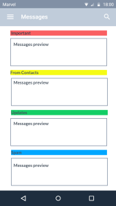
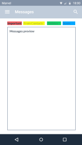
With Android rolling out RCS (Rich Communication Services) messages, I thought I can share a suggestion to organise the messages in a better way so that we don’t miss out any messages that are important. Besides, too many spam messages are annoying, which keeps me away from opening the messages app and there certainly should be an option to filter these spam messages. Google has implemented tabbed messages in Gmail and thought why not we have a similar option for the messages too with four tabs. The first tab can be for Important alert messages like bank alerts, ATM withdrawal alerts, credit card spending, OTPs, stock market trade details, online wallet transfers and purchase receipts …etc. The second tab can be for the messages From Contacts. All other messages which might not be important and might not be spam too can be in the third tab, Updates. The marketing and spam messages in the fourth tab, Spam.
Below are a few layout suggestions to organise and display the messages. They are the candidates to experiment and understand which serves the users best and which the users love. The layout can have grid, list and tab views to display the messages. This UI presentation makes the messages to be organized and well presented. More importantly, it helps in noticing important messages and making decisions quickly, which is missing today in the messaging app. The time to act upon a required message will be less here when compared to the current message inbox. Apart from the layouts suggested, it would also be helpful if the user has feature to sort unread messages, follow-up messages and add reminders to the messages. All these improvements can eventually make the experience of using the messaging app much better.

(Designed using Marvel)
(Designed using Marvel)
(Designed using Marvel)
References:
A Plan for Spam – http://paulgraham.com/spam.html
Better Bayesian Filtering – http://paulgraham.com/better.html
Filters that Fight Back – http://paulgraham.com/ffb.html
Mobile UX Design: List View and Grid View – https://uxplanet.org/mobile-ux-design-list-view-and-grid-view-8f129b56fd5b
Web Layout Best Practices: 12 Timeless UI Patterns Analyzed – https://www.uxpin.com/studio/blog/web-layout-best-practices-12-timeless-ui-patterns-explained
Thanks to Pari & Ravi for reviewing the draft and the feedback 🙂
Addendum:
These days, after shopping at stores, very few people save the physical receipts, which would be used in case of exchanges, warranty or for any other tracking purpose. It would be of great help if the messages app also has options to categorize and store receipts, that are sent as messages after billing through POS machines. Additionally, these receipts can also be useful to redeem loyalty points. Gradually, shops can eliminate the necessity to issue physical copy of receipts. If the Messages app can summarize all the spends for a month or year that would be an added delight, which would help us manage budgets.
Also, I m interested to have Google pay integration with Messages. If I receive my monthly notification for credit card payment or phone bills, I should be allowed to pay directly from the Messages app.
